Not Found
Not Found
Not Found
Not Found
Not Found
Not Found
Not Found
Not Found
Not Found
Not Found
Not Found
Not Found
Not Found
Not Found
Not Found
Not Found
Not Found
Not Found
Not Found
Not Found

Submitted

Blog Preview Card using Flexbox

P

@emanuelrferreira

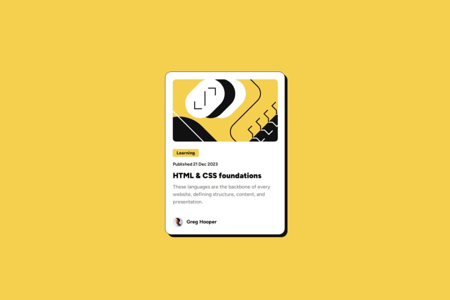
Desktop design screenshot for the Blog preview card coding challenge

This is a solution for...

  • HTML
  • CSS
1newbie
View challenge

Design comparison


SolutionDesign

Solution retrospective


What are you most proud of, and what would you do differently next time?

Having managed to use flexbox in a more fluid way compared to my last practice.

What challenges did you encounter, and how did you overcome them?

To understand how flexbox works in landscape mode, I needed to do some research and testing in order to try to resolve the responsiveness of it.

What specific areas of your project would you like help with?

I'm still struggling with flexbox in general, so it would be good to have some tips and tricks on the topic.

Community feedback

@krushnasinnarkar

Posted

Hi @emanuelrferreira,

Congratulations on successfully completing the challenge! Your code is well-structured, and the website works perfectly across different screens.

Flexbox is a powerful layout tool in CSS, but it can be tricky to master. Here are some tips and tricks to help you get more comfortable with flexbox:

Basic Concepts

  1. Flex Container and Flex Items:
    • The parent element becomes the flex container (display: flex), and its children become flex items.
  2. Main Axis and Cross Axis:
    • The main axis is defined by flex-direction. If flex-direction is row, the main axis is horizontal, and if it's column, the main axis is vertical.
    • The cross axis is perpendicular to the main axis.

Flex Container Properties

  1. display:

    • flex or inline-flex: Defines a flex container and enables flexbox layout.
  2. flex-direction:

    • row: Default; lays out items horizontally.
    • row-reverse: Horizontally in reverse order.
    • column: Vertically.
    • column-reverse: Vertically in reverse order.
  3. flex-wrap:

    • nowrap: Default; all items are on one line.
    • wrap: Items wrap onto multiple lines.
    • wrap-reverse: Items wrap onto multiple lines in reverse order.
  4. justify-content (along the main axis):

    • flex-start: Aligns items at the start.
    • flex-end: Aligns items at the end.
    • center: Centers items.
    • space-between: Spaces items evenly with the first item at the start and last item at the end.
    • space-around: Spaces items evenly with equal space around them.
    • space-evenly: Spaces items with equal space between them.
  5. align-items (along the cross axis):

    • stretch: Default; stretches items to fill the container.
    • flex-start: Aligns items at the start.
    • flex-end: Aligns items at the end.
    • center: Centers items.
    • baseline: Aligns items along their baseline.
  6. align-content (for multi-line flex containers):

    • stretch: Default; stretches lines to fill the container.
    • flex-start: Lines packed to the start.
    • flex-end: Lines packed to the end.
    • center: Lines packed to the center.
    • space-between: Lines evenly spaced with the first line at the start and last line at the end.
    • space-around: Lines evenly spaced with equal space around them.
    • space-evenly: Lines evenly spaced with equal space between them.

Flex Item Properties

  1. order:

    • Controls the order of items; default is 0. Items with higher values will appear later.
  2. flex-grow:

    • Controls how much an item will grow relative to others; default is 0.
  3. flex-shrink:

    • Controls how much an item will shrink relative to others; default is 1.
  4. flex-basis:

    • Sets the initial size of an item before any growing or shrinking.
  5. align-self:

    • Overrides align-items for individual flex items.

Practical Tips

  1. Use Flexbox for Simple Layouts:

    • Use flexbox for layouts where you need items to align or distribute space along a single axis (either horizontally or vertically).
  2. Combine with Other Layout Techniques:

    • Flexbox works well in combination with other layout methods like CSS Grid. Use flexbox for alignment within grid items.
  3. Responsive Design:

    • Flexbox is excellent for responsive designs. Use flex-wrap and percentages or relative units to create flexible layouts.
  4. Debugging Tools:

    • Use browser dev tools to inspect flexbox properties. Most modern browsers have great support for visualizing flexbox layouts.
  5. Avoid Overuse:

    • While powerful, flexbox is not always the best solution for every layout. Sometimes, simpler methods like floats or CSS Grid might be more appropriate.

I have a suggestion that might be helpful:

The card is not responsive for screen sizes less than 327px; this is because of the direct use of width. Try using max-width instead to make it more flexible and responsive on smaller screens.

I hope you find this helpful, and I would greatly appreciate it if you could mark my comment as helpful if it was.

Feel free to reach out if you have more questions or need further assistance.

Happy coding!

Marked as helpful

0

P

@emanuelrferreira

Posted

Thank you v much for all the tips and observations @krushnasinnarkar ! It was quite insightful!

0

Please log in to post a comment

Log in with GitHub
Discord logo

Join our Discord community

Join thousands of Frontend Mentor community members taking the challenges, sharing resources, helping each other, and chatting about all things front-end!

Join our Discord