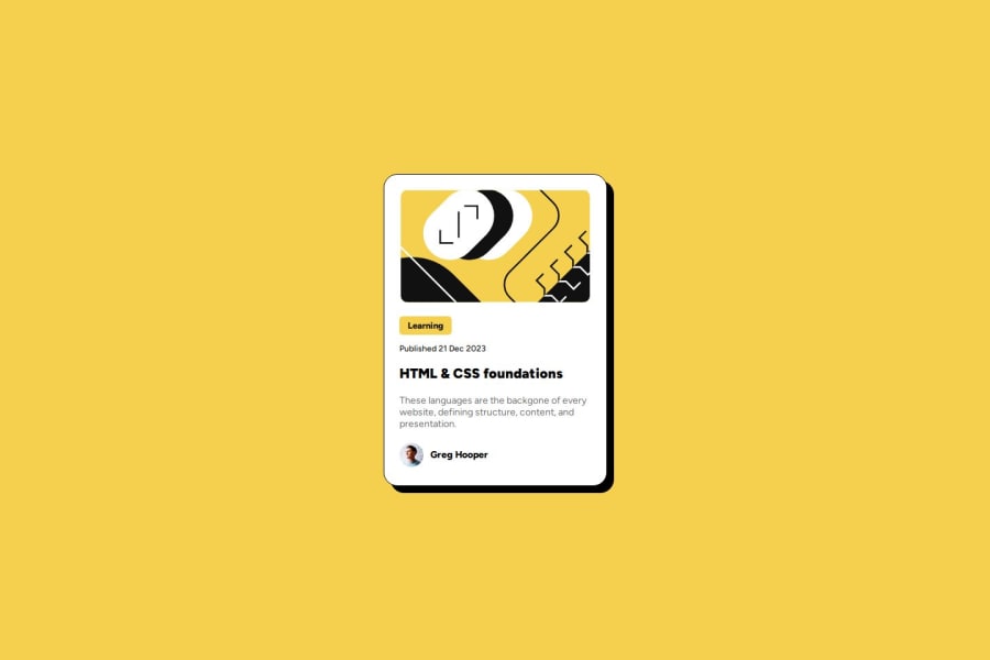
Design comparison
Solution retrospective
I measured layout sizes in a photo editor to get exact number of pixels. Working with these measurements I was really happy with how similar the result came out.
Still getting used to how best structure CSS selectors.
What challenges did you encounter, and how did you overcome them?For the "Learning" badge, I struggled to align the background color box around the text. Originally I specified width in pixels to make it center around the word, but not good practice if the word length changes. I ctrl-spaced and discovered the fit-content property, which combined with padding, seems like a perfect solution.
What specific areas of your project would you like help with?Not sure if I could have systemized my class selectors better. Felt like I was having to fine-tune individual elements a lot.
Community feedback
Please log in to post a comment
Log in with GitHubJoin our Discord community
Join thousands of Frontend Mentor community members taking the challenges, sharing resources, helping each other, and chatting about all things front-end!
Join our Discord
