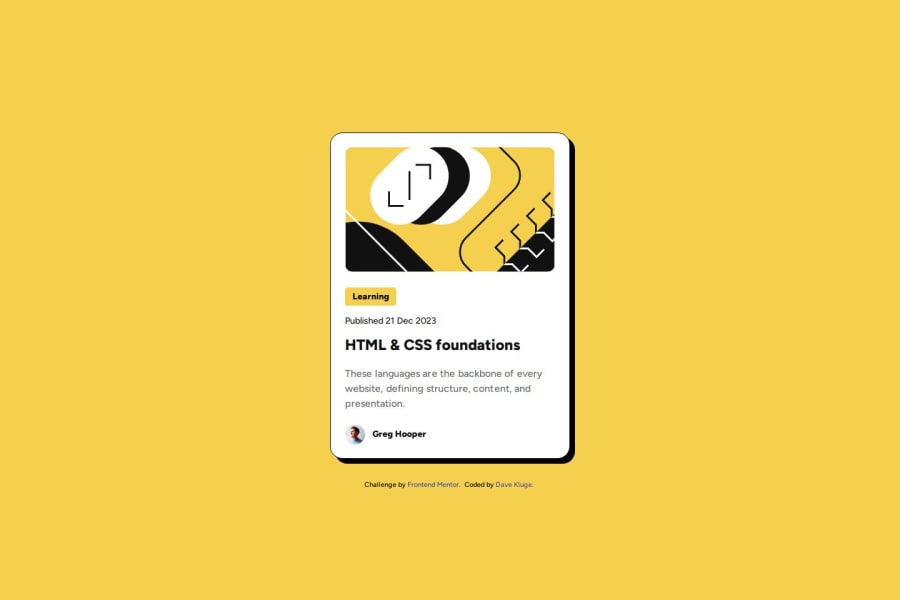
Design comparison
SolutionDesign
Solution retrospective
What are you most proud of, and what would you do differently next time?
I am most proud of learning how to use the Figma File to create a more accurate representation of the design.
What challenges did you encounter, and how did you overcome them?Some challenges included figuring out how to justify and align all the elements within the card correctly. I solved these using
display: grid;
justify-content: center;
align-items: center;
position: relative;
I am curios how other people solved the indenting of the title and paragraph in the hover state.
Community feedback
Please log in to post a comment
Log in with GitHubJoin our Discord community
Join thousands of Frontend Mentor community members taking the challenges, sharing resources, helping each other, and chatting about all things front-end!
Join our Discord
