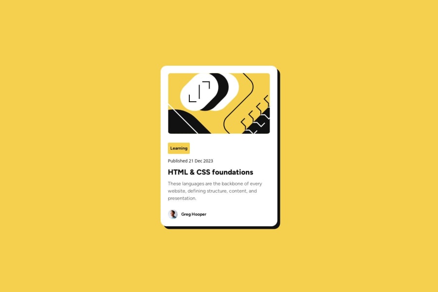
Design comparison
Solution retrospective
Was able to create this solution relatively quickly in ~1 hour so am proud of the progress that I have made in HTML/CSS.
What challenges did you encounter, and how did you overcome them?Some of the fonts in the Figma file did not match 100% with my solution despite using the correct fonts. Wasn't sure what I was doing incorrectly?
What specific areas of your project would you like help with?Looking at HTML to make sure it is semantic and looking at CSS code to ensure it follows best practices.
Community feedback
- @StroudyPosted about 2 months ago
Amazing job with this! You’re making fantastic progress. Here are some small tweaks that might take your solution to the next level…
-
Using
font-display: swap
in your@font-face
rule improves performance by showing fallback text until the custom font loads, preventing a blank screen (flash of invisible text). The downside is a brief flash when the font switches, but it’s usually better than waiting for text to appear. -
I think you can benefit from using a naming convention like BEM (Block, Element, Modifier) is beneficial because it makes your CSS more organized, readable, and easier to maintain. BEM helps you clearly understand the purpose of each class, avoid naming conflicts, and create reusable components, leading to a more scalable codebase. For more details BEM,
-
Using
rem
orem
units in@media
queries is better thanpx
because they are relative units that adapt to user settings, like their preferred font size. This makes your design more responsive and accessible, ensuring it looks good on different devices and respects user preferences. -
Line height is usually unitless to scale proportionally with the font size, keeping text readable across different devices. Best practice is to use a unitless value like
1.5
for flexibility. Avoid using fixed units likepx
or%
, as they don't adapt well to changes in font size or layout. -
While
px
is useful for precise, fixed sizing, such asborder-width
,border-radius
,inline-padding
, and<img>
sizes, it has limitations. Pixels don't scale well with user settings or adapt to different devices, which can negatively impact accessibility and responsiveness. For example, usingpx
for font sizes can make text harder to read on some screens, Check this article why font-size must NEVER be in pixels. In contrast, relative units likerem
and adjust based on the user’s preferences and device settings, making your design more flexible and accessible. Usepx
where exact sizing is needed, but prefer relative units for scalable layouts. If you want a deeper explanation watch this video by Kevin Powell CSS em and rem explained. Another great resource I found useful is this px to rem converter based on the default font-size of 16 pixel.
You’re doing fantastic! I hope these tips help you as you continue your coding journey. Stay curious and keep experimenting—every challenge is an opportunity to learn. Have fun, and keep coding with confidence! 🌟
Marked as helpful1@silveradityaPosted about 2 months ago@Stroudy
Thanks so much for the detailed feedback. All of the above are extremely helpful bits of feedback and I really appreciate you taking time out to suggest these. Will be implementing this feedback as part of future projects!
1@StroudyPosted about 2 months agoHey @silveraditya, You got this, I will be on the lookout for your next project 💪
0 -
- @Kurt3zPosted about 2 months ago
The .article-date class has the font-family property set to: 'Figtree-Vari`able', sans-serif. Maybe that's because some fonts are not correct, check them all. Otherwise, your solution looks very good, and detailed, very similar to the design. Congratulations!
1
Please log in to post a comment
Log in with GitHubJoin our Discord community
Join thousands of Frontend Mentor community members taking the challenges, sharing resources, helping each other, and chatting about all things front-end!
Join our Discord