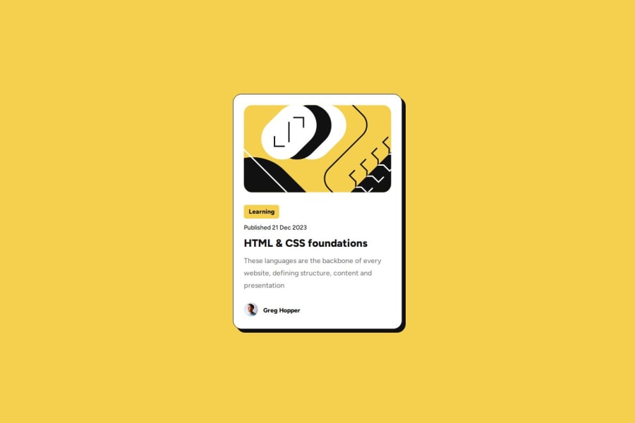
Design comparison
SolutionDesign
Solution retrospective
What are you most proud of, and what would you do differently next time?
I think I nailed it at the layout and positioning. I should research more about media queries and responsiveness.
What challenges did you encounter, and how did you overcome them?I had to learn how to customize the mouse pointer to match the design, so I searched for it at FreeCodeCamp. Also, I extracted de cursor image from the Figma files.
What specific areas of your project would you like help with?Media queries and responsiveness
Community feedback
Please log in to post a comment
Log in with GitHubJoin our Discord community
Join thousands of Frontend Mentor community members taking the challenges, sharing resources, helping each other, and chatting about all things front-end!
Join our Discord
