Submitted 10 months ago
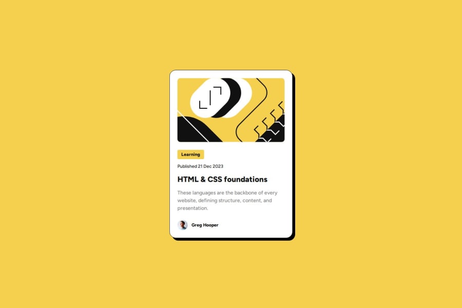
Blog Preview Card using CSS Variables and Flexbox

P
@iddahadev

Design comparison
SolutionDesign

Solution retrospective
What are you most proud of, and what would you do differently next time?
Things I am proud of
- Semantic HTML (I tried my best)
- CSS Variables where it made sense to me (I still have a lot to learn)
- I added a transition for the
box-shadowfor the card and thecolorfor the card's title
- Pixel Perfect -> I tried my best by relying upon the Figma File but it was not enough.
- Units for spacing and font size: I chose px for padding and rem for the rest.
HTML
- Semantic
- Accessibility
CSS
- Responsive
- Which unit to choose for spacing (padding, margin, gap...)
Community feedback
Please log in to post a comment
Log in with GitHub
Join our Discord community
Join thousands of Frontend Mentor community members taking the challenges, sharing resources, helping each other, and chatting about all things front-end!
Join our Discord