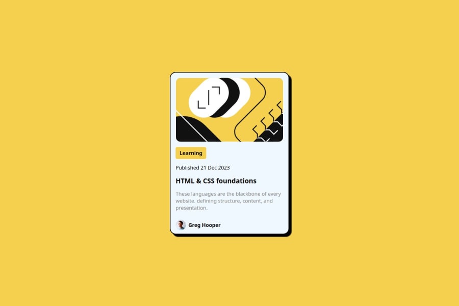
Design comparison
Solution retrospective
Is there a way to make my code more concise? And please let me know if my CSS code is up to standard or if there are any missing parts. I would appreciate your feedback.
Community feedback
- @Grimm-NPosted 5 days ago
First off, amazing work! 👏 Your attention to detail really shines through, and it’s clear you’re putting in the effort to make this look polished and professional. Great job so far! 🎉
Just a few quick tips that might help take things to the next level:
-
Add some Space Outside the Card (or Try Using 85-90vw): On mobile, it can feel a bit “sticky” if the card goes edge-to-edge on the screen. Adding a bit of margin or setting the card’s width to around 85-90vw will give it a nice cushion on the sides, making it easier to read and visually less cramped. 📱💨 This small adjustment can make a big difference for mobile users!
-
Use a CSS Reset: Styling resets like A (more) Modern CSS Reset by Andy Bell are life-savers. 🧹 They clear out default browser styling so you start with a clean slate, ensuring a consistent look across all browsers. Without a reset, different browsers might interpret default styles differently, leading to unexpected (and sometimes frustrating!) layout shifts. Let’s keep it neat and predictable! 👍
-
Use Relative Units (em, rem, %, vw, vh) Instead of Pixels: Try to embrace relative units everywhere—it may feel a bit strange at first, but it makes your layout much more responsive! 🌐 Relative units adapt better across different screen sizes and user settings (like increased base font sizes for accessibility). This tiny shift in mindset can really future-proof your designs! 🚀
-
Get Friendly with BEM: BEM naming rules might seem odd at first, but they keep your classes structured and easy to read. BEM will save you from the dreaded “which
.button
is this?” nightmare! 🎩 So, start small, and soon BEM will feel like second nature. -
Give Classes to All Elements: It might seem like a lot at first, but giving every element a class makes your code way easier to work with, debug, and style. 🕵️♂️ Plus, you’ll save yourself from accidentally styling things you didn’t mean to! 🌈 The extra organization will make everything clearer and more manageable.
Keep up the fantastic work—small adjustments like these can make a huge difference. 🚀
1 -
Please log in to post a comment
Log in with GitHubJoin our Discord community
Join thousands of Frontend Mentor community members taking the challenges, sharing resources, helping each other, and chatting about all things front-end!
Join our Discord