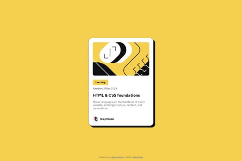
Not Found
Not Found
Not Found
Not Found
Not Found
Not Found
Not Found
Not Found
Not Found
Not Found
Not Found
Not Found
Not Found
Not Found
Not Found
Not Found
Not Found
Not Found
Not Found
Not Found

Submitted

Blog Preview Card using CSS

P
Austin H. 270

@austinh-io

Desktop design screenshot for the Blog preview card coding challenge

This is a solution for...

  • HTML
  • CSS
1newbie
View challenge

Design comparison


SolutionDesign

Solution retrospective


What are you most proud of, and what would you do differently next time?

I am not sure what else I would do differently next time, as all I used was basic CSS and HTML.

What challenges did you encounter, and how did you overcome them?

It was difficult to find out what the challenge asked for when it said "try not to use media queries." I had a hard time figuring that out, and ended up using media queries anyway.

What specific areas of your project would you like help with?

I would like to know more about solutions not using media queries for changing the font size at different screen sizes.

Community feedback

T
Grace 29,310

@grace-snow

Posted

You've had some great feedback already, but everyone has missed the most important critical problem in this solution. Where is the link to the blog??? This is a functional component with a hover style that indicates it should be interactive. It should act as a signposting component (i.e. a link) to the blog. Without this, the component does nothing at all, like it is broken.

Other tips

  • think about the context of where this component would be used. It is extremely unlikely it would act as a page heading so should not have a h1. Use a lower importance heading level.
  • look up how and when to write alt text on images. There are a few good posts about this in the resources channel on the frontend mentor discord server.
  • try to never have text in divs or spans alone, which are meaningless elements. Use a meaningful element every time, even paragraph has meaning.
  • it's better for performance to link fonts in the html head instead of css imports.
  • the body should have min-height not height. This is broken on my mobile especially in landscape view because you have limited the height of the body like this.
  • work mobile first. I don't think this challenge needs a media query at all actually and wouldn't need it once you remove all the unnecessary heights and widths. But when you do need media queries you shouldn't be setting them like this. Read this post about how to use and define media queries correctly: https://fedmentor.dev/posts/responsive-meaning/
  • Get into the habit of including a full modern css reset at the start of the styles in every project. Look up Andy Bell's modern css reset and use that.

Marked as helpful

1

@TedJenkler

Posted

Hi @austinh-io,

Nice project—I love the animation!

I noticed that you're slightly overusing <div> elements. Always try to minimize the use of <divs> as much as possible. For instance, when using Flexbox, you can have <img> elements as children, so some of the <divs> aren't really necessary.

When you do use <div> elements, consider adding aria-labels to describe them. If there's a section that screen readers can skip because it's not important, you can use aria-hidden="true" to make them skip it. (Thanks @geomydas btw)

Hope this feedback helps!

Best, Teodor

Marked as helpful

1

geomydas 1,060

@geomydas

Posted

@TedJenkler I know this is the wrong post but regarding the discussion about having aria-labels on div, I actually got answer from an accesibility expert, thanks @Grace-Snow

"Divs shouldn't have aria-labels. Aria should only be used when necessary and must be on elements that have a role. I can't see why the QR component would need any additional semantics or labelling."

2
geomydas 1,060

@geomydas

Posted

After taking a look at your code, here is the following feedback:

  1. Use a formatter such as Prettier (its a VSCode extension) so that your code is more readable. The current code has inconsistent indentations and using a formatter will easily fix that

  2. Take a look at the BEM methodology for CSS so you can name your classes more effectively, easily and easier to read.

  3. There is no need to change the font size using media queries. The font size in the design is both the same on both mobile and desktop versions

  4. Never set fixed height and widths. Such as height: 532px. The content of the element will be enough to take up the height. Using fixed widths and heights may cause overflowing issues. An alternative is to use max-width for widths, and min-height for heights. Min-height is often a last resort though.

  5. Never set font-related properties in px!. The reason why you shouldn't set them in px is because it doesn't respect the user's set font-size and instead you should use the rem unit instead. See why.

  6. Learn to decide when to use rem vs px. Most of the time, you would use rem instead of px. The only cases where you would use px is for decorative stuff such as box-shadow, border, border-radius and etc.

Marked as helpful

1
Boris 2,870

@mkboris

Posted

Great work You can use the clamp() function to ensure text adjusts smoothly across different screen sizes without using media queries. Like so

h1 { font-size: clamp(1.5rem, 2vw + 1rem, 3rem); }

Marked as helpful

1

@ZahirHaniche-dev

Posted

Great job on your project, my friend; the result is really impressive. After reviewing your code, I suggest implementing Vite, and perhaps even migrating your application to ReactJS to gain experience with this library. Once again, well done, and best of luck moving forward!

0

Please log in to post a comment

Log in with GitHub
Discord logo

Join our Discord community

Join thousands of Frontend Mentor community members taking the challenges, sharing resources, helping each other, and chatting about all things front-end!

Join our Discord