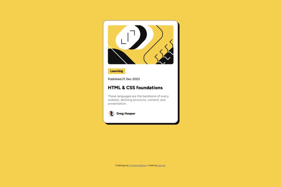
Design comparison
SolutionDesign
Solution retrospective
What are you most proud of, and what would you do differently next time?
I'll definitely use Figma, transitions and CSS variables.
What challenges did you encounter, and how did you overcome them?I had a problem with background for "Learning" element. I didn't want to guess the width, so I searched for some property that can fix it. Fortunately, CSS has a keyword "fit-content" that can be applied to width.
Community feedback
Please log in to post a comment
Log in with GitHubJoin our Discord community
Join thousands of Frontend Mentor community members taking the challenges, sharing resources, helping each other, and chatting about all things front-end!
Join our Discord
