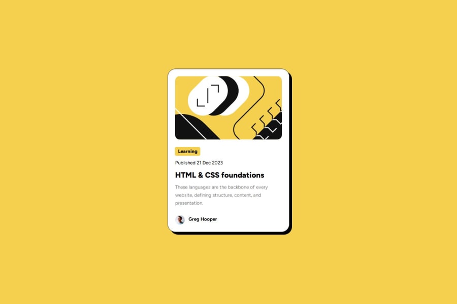
Design comparison
Solution retrospective
Nothing I'm proud of.
I would animate the box shadow with mouse's position next time if possible.
What challenges did you encounter, and how did you overcome them?I wasn't able to make border of article image to be round after using media queries to adjust its height and width. I also wasn't able to make mobile design perfect after using media queries. I don't know whether to make the font smaller to make it look like mobile design or just manually adjust them accordingly. I wasn't able to overcome these.
What specific areas of your project would you like help with?I wish to learn flex and flexbox to solve problem. Instead of using CSS grid every where. I wonder if its harder than CSS grid.
Community feedback
- @Alex-Archer-IPosted 11 months ago
Hi! Good work =) Cool idea with hover and the box-shadow.
You don't have to declare height for img - you can just use width and it'll keep it's proportions. Also you can use percentages to make it responsive.
Yeah, flex is much easier than a grid. Just set display of parent element to flex and use align-items and justify-content (not 'justify-items' like in grid) to arrange content.
.flex {
    display: flex;
    flex-direction: column;  /* row is default value */
    align-items: center;
    justify-content: center;
}
And hey - I learned how to use backticks =)
Marked as helpful1@TwinkleBytePosted 10 months ago@Alex-Archer-I Nice. Your reply looks more professional now. :)
Removing height for the article-img inside media query fixed the issue with border-radius.
I see. I can heard using percentage for elements is bad practice but I guess its good practice to use it for images. Also, thanks for teaching me how to use flex. Your feedback is great as always.
1@Alex-Archer-IPosted 10 months ago@LoneBrokeBoy Thank you =)
I usually use percentage for creating responsive elements like this:
main {
    width: 95%;
    max-width: 40rem;
}
When display size is less than 40 rem this element always will be 95% from it. And for images I meant using
width: 100%for those that should stretch with the element - like header picture - and using px or rem for static pictures - like user profile. But I'll read more about pros and cons of percentages.So, thanks again. Fell free to ask, comment and stuff =)
0
Please log in to post a comment
Log in with GitHubJoin our Discord community
Join thousands of Frontend Mentor community members taking the challenges, sharing resources, helping each other, and chatting about all things front-end!
Join our Discord
