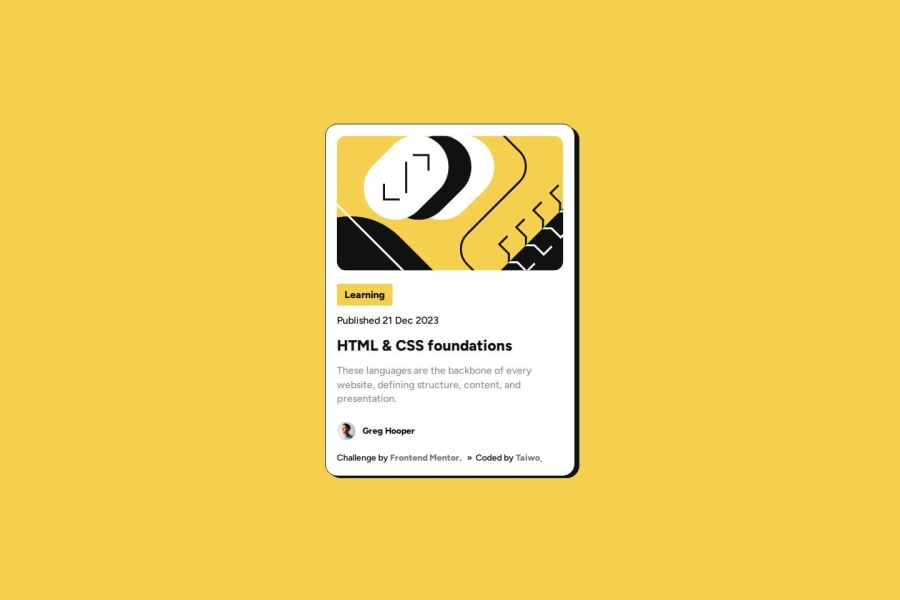
Blog preview card using CSS Flexbox


Design comparison

Solution retrospective
-
Clean and Responsive Design: The code utilizes media queries to ensure the layout adapts to different screen sizes, showcasing a user-friendly approach.
-
Custom Fonts: The inclusion of custom fonts adds a unique visual style to the card, elevating the overall design.
-
Semantic HTML Structure: The use of semantic elements (header, section, etc.) likely creates a well-organized and meaningful structure for the content.
-
Understanding Media Queries: Implementing responsive design using media queries can be challenging. I might have overcome this by researching tutorials or documentation to grasp the concept and syntax.
-
Working with Custom Fonts: Custom fonts can introduce complexities. I might have tackled this by consulting resources on font-face declarations and ensuring proper file paths.
-
Balancing Visual Appeal with Readability: Balancing aesthetics with a clear information hierarchy can be tricky. I might have addressed this by using contrasting colors and appropriate font sizes for optimal readability.
-
Advanced CSS Techniques: While the code demonstrates responsive design fundamentals, there might be a desire to explore advanced CSS techniques like Flexbox or Grid for more complex layouts.
-
Interactive Elements: The card currently displays static content. I might be interested in adding interactive components like buttons, hover effects, or animations for improved user engagement.
-
Accessibility Best Practices: Implementing best practices for accessibility ensures everyone can experience the content.
Community feedback
Please log in to post a comment
Log in with GitHub
Join our Discord community
Join thousands of Frontend Mentor community members taking the challenges, sharing resources, helping each other, and chatting about all things front-end!
Join our Discord