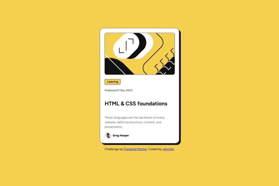
Design comparison
Solution retrospective
This challenge went slightly better than my first. I used the Figma design details to set size requirements, however I struggled still struggled to get the desired responsiveness. I welcome any feedback on how to achieve this.
I am proud that I successfully used CSS-Flexbox and @media queries to add the hover and pointer. I am also proud that I worked through the challenge quicker than last time and didn't have any trouble with github.
What challenges did you encounter, and how did you overcome them?I encountered trouble with the responsive design. I tried adding multiple media queries for different sizes, but that caused the smallest size to overflow the container. I wasn't sure how to fix that, so I relented with removing the middle size adjustments.
What specific areas of your project would you like help with?I could use some feedback on responsive design and flexbox use. Any resources you can suggest will be appreciated.
Community feedback
Please log in to post a comment
Log in with GitHubJoin our Discord community
Join thousands of Frontend Mentor community members taking the challenges, sharing resources, helping each other, and chatting about all things front-end!
Join our Discord
