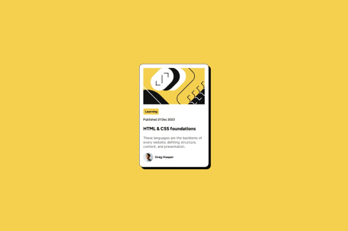
Blog Preview Card using CSS Flexbox

Solution retrospective
I think I am most proud of finishing this in less than 3 hours while making it a little close to the source, and the fact that I managed to make it responsive using just Flexbox. I think I would try grid or use plain CSS then implement media queries just to enhance more on my basic skills
What challenges did you encounter, and how did you overcome them?I encountered a lot and took time to research on Google / Stack overflow. These mostly involves importing font faces or true type font templates, adding svg images, and then using webp! It's the first time I encountered and used the picture and source tags...
What specific areas of your project would you like help with?I'm open to learning other perspective or better solution which may help in making my script better in terms of readability.
Also, in terms of how I displayed the images, I'm still not sure if using the max-width so it doesn't overflow and setting a fixed size on its container is the best solution in that aspect. If anyone could help me figure out how to better set the size of my card to match the original.. how can i figure which max-height or max-width would be best set?
Please log in to post a comment
Log in with GitHubCommunity feedback
No feedback yet. Be the first to give feedback on Jas's solution.
Join our Discord community
Join thousands of Frontend Mentor community members taking the challenges, sharing resources, helping each other, and chatting about all things front-end!
Join our Discord