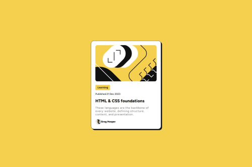
Not Found
Not Found
Not Found
Not Found
Not Found
Not Found
Not Found
Not Found
Not Found
Not Found
Not Found
Not Found
Not Found
Not Found
Not Found
Not Found
Not Found
Not Found
Not Found
Not Found

Submitted

Blog preview card using CSS Flexbox

P

@Antonvasilache

Desktop design screenshot for the Blog preview card coding challenge

This is a solution for...

  • HTML
  • CSS
1newbie
View challenge

Design comparison


SolutionDesign

Solution retrospective


What are you most proud of, and what would you do differently next time?

  • Creating and placing the box shadow according to the design
  • Creating an active state
  • Integrating the box-shadow into that active state

What challenges did you encounter, and how did you overcome them?

  • Adjusting the spacing between the elements to make it look like the design file - took multiple trials and errors to do it without too many fixed values

What specific areas of your project would you like help with?

  • Not sure how best to adjust the font for mobile view, without using media query. Tried using vw for font-size, but the result does not seem visible.

Community feedback

P

@Temceo

Posted

A very good replication of the brief - well done.

A few minor areas for improvement -

To make the container centred on all views (especially mobile) place the display flex on the body and make the width of the container a percent of the body, with a max width in pixels - see example below -

body {
  font-family: "Figtree", sans-serif;
  min-height: 100vh;
  display: flex;
  justify-content: center;
  align-items: center;
}

.container {
  padding: 1rem;
  width: 90%;
  max-width: 375px;
  margin-inline: auto;
}

Also consider using css variables for your colours as it makes it easier to remember - see example below:

:root {
  --clr-white: hsl(0%, 0%, 100%);;
}

.content {
  background-color: var(--clr-white);
}

You can read further on css variables here - mdn - css variables

Marked as helpful

1
P
Aminpatra 260

@Aminpatra

Posted

Your solution is very good in this one, but here is a tip to save time. Instead of repeating the same color percentages you can define a :root selector, and you can call its elements by typing -> color: var(--"the color name"). So the final result for this project will be like this : ''' :root { --Yellow: hsl(47, 88%, 63%); --White: hsl(0, 0%, 100%); --Grey: hsl(0, 0%, 50%); --Black: hsl(0, 0%, 7%); --font-mid: 500; --font-bold: 800; } ''' Sorry I don't know yet how to format texts in this feedback thing :)

Marked as helpful

1

Please log in to post a comment

Log in with GitHub
Discord logo

Join our Discord community

Join thousands of Frontend Mentor community members taking the challenges, sharing resources, helping each other, and chatting about all things front-end!

Join our Discord