Not Found
Not Found
Not Found
Not Found
Not Found
Not Found
Not Found
Not Found
Not Found
Not Found
Not Found
Not Found
Not Found
Not Found
Not Found
Not Found
Not Found
Not Found
Not Found
Not Found

Submitted

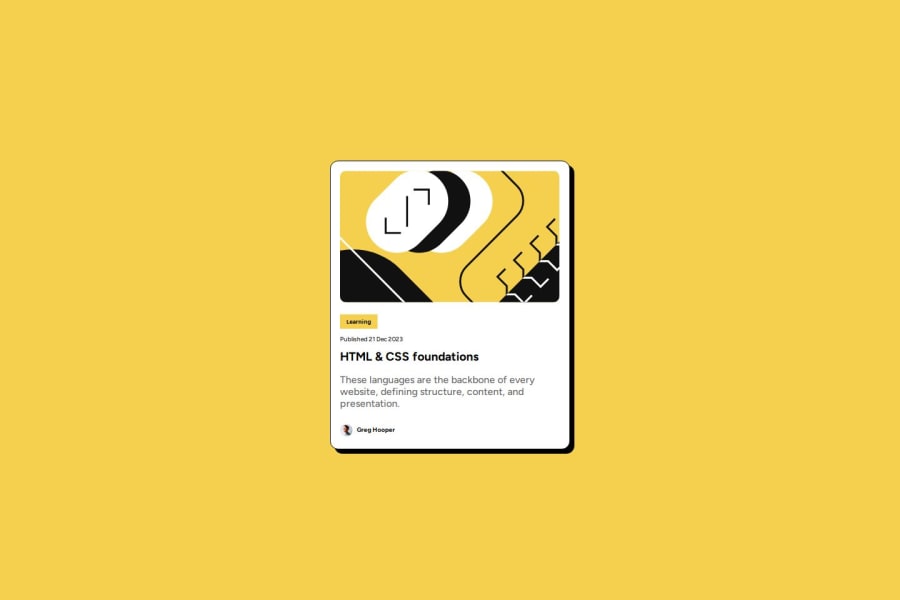
Blog-preview-card using CSS Flexbox

@rawatdinesh10

Desktop design screenshot for the Blog preview card coding challenge

This is a solution for...

  • HTML
  • CSS
1newbie
View challenge

Design comparison


SolutionDesign

Solution retrospective


What are you most proud of, and what would you do differently next time?

I have learned about Flexbox in more details, Flexbox's different properties. I have used Google fonts in the challenge. I learned about CSS hover state and box-shadow properties. These are the things I'm most proud of. In my next challenge I would use Flexbox(if there is need) without going though the reference guide. I would also use more CSS properties (which I learned from this challenge) without going through the reference material.

What challenges did you encounter, and how did you overcome them?

I had issue in difference between preview pane and browser viewing of the challenge, which I had helped from discord community and they helped me to resolve my issue.

What specific areas of your project would you like help with?

How can I use media-queries in my project to make it responsive. Please help me on Media-queries. I want to know more about em and rem, how they are different from px, when and where to use them. How do I decide when to use em and when to use rem?

Community feedback

T
Grace 29,310

@grace-snow

Posted

This looks a lot smaller than the original, so try to get it much closer if you can.

I just gave lots of feedback on this challenge to someone else tonight and a lot of that will be relevant to you as well so I recommend you take a look and read it carefully.

But other items for you specifically to look at are:

  • you've got the link in the wrong place in the card. Learning is not interactive, that's just a category. It's the blog title that should have a link inside the heading element.
  • remove all the huge margins. Center the component using flex column properties and min-height 100svh on the body.
  • I also think you're misunderstanding margins and paddings generally. This card should have padding to keep content from hitting its edges. The child elements within the card should only need vertical margins to keep them apart from each other (or the gap property in flex/grid environments). See https://fedmentor.dev/posts/padding-margin/ for more detail.
  • try to make sure you Indent your code consistently so it's easier to read and spot bugs. Your code editor can even do this formatting automatically for you with prettier.

Marked as helpful

2

@rawatdinesh10

Posted

@grace-snow I have edited my code now as per your instructions. I have removed big margins, used button tag instead of <a> tag for 'learning'. In design file solution, there is no footer shown, but in my solution footer is showing(the last elements in html). How can I not show them in my solution.

0

@rawatdinesh10

Posted

@grace-snow I'm using prettier in vs code but it isn't indenting code automatically. what's the reason?

0
T
Grace 29,310

@grace-snow

Posted

@rawatdinesh10 check your settings and select format on save or learn what command you need to do to make it format.

0
T
Grace 29,310

@grace-snow

Posted

@rawatdinesh10 learning is not the interactive element either. Was my comment unclear? This component is meant to link to a blog so it's the blog heading that is the interactive element here. Learning is just a paragraph, it's text information not something to be clicked on.

And I don't understand what you're asking about a footer. It's good to have the attribution footer on challenges, shows respect and provides links to frontend mentor and to you.

0

@SvitlanaSuslenkova

Posted

body { display: flex; flex-direction: column; justify-content: center; align-items: center; min-height: 100vh; } Try this to align(top-bottom) and justify(left-right) your project to the center. It applies to the parent component(body), don't forget about !!min-height!!. You can use grid instead of flex too.

Hope you found this comment helpful :)

Marked as helpful

2

@rawatdinesh10

Posted

@SvitlanaSuslenkova I have applied flex properties on container-box. if flex properties apply to body then why do we need flex-container in flexbox? which properties should I apply to container-box?

0

@SvitlanaSuslenkova

Posted

@rawatdinesh10 if you want to center a div in b div, you add flex to b div (parent element).

0

@rawatdinesh10

Posted

@SvitlanaSuslenkova yes, i applied display: flex property to container box(parent element), which was having children elements, but you said apply it to body element.

0

@SvitlanaSuslenkova

Posted

@rawatdinesh10

  1. you already have <main>, you don't even need to double it with a div, you could just add css of container to the main and not create it.

  2. I meen to center your project inside of the body.

0

Please log in to post a comment

Log in with GitHub
Discord logo

Join our Discord community

Join thousands of Frontend Mentor community members taking the challenges, sharing resources, helping each other, and chatting about all things front-end!

Join our Discord