

Design comparison

Solution retrospective
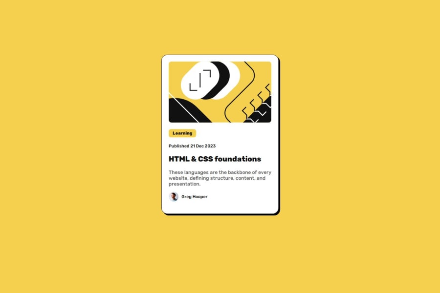
I was challenged to center the card horizontally and vertically and I did it after a research and CSS rules recap.
What challenges did you encounter, and how did you overcome them?I decided to use CSS Flexbox, I dod some research and recap for it and then managed to use it in this project.
What specific areas of your project would you like help with?I tried to build semantic HTML, however, it is not the best structure I think.
Community feedback
- @5nufkinPosted 3 months ago
Hi there,
I noticed a few things that could improve the structure and responsiveness of your project:
<svg>method: I’m not very familiar with the specific method you used within your<svg>tag, What tool/technique did you use there?Missing
<main>tag: It’s good practice to wrap your main content inside a<main>tag to improve accessibility and semantic structure. I recommend wrapping your main content with this tag for better organization and readability.Responsiveness: I noticed that the layout breaks when the screen size is reduced, causing elements to go out of place. Consider using relative units like
remfor sizing instead of fixed units likepx.remtakes into account the user's font size settings, which improves accessibility. This could help ensure the layout adapts better to different screen sizes.emis another option, but as mentioned,remis generally more reliable for responsive design.CSS classes: I’d also suggest adding more classes to your HTML elements and targeting them in your CSS. This will make your CSS more scalable and easier to manage in larger projects where there are multiple elements of the same type.
0

Please log in to post a comment
Log in with GitHubJoin our Discord community
Join thousands of Frontend Mentor community members taking the challenges, sharing resources, helping each other, and chatting about all things front-end!
Join our Discord