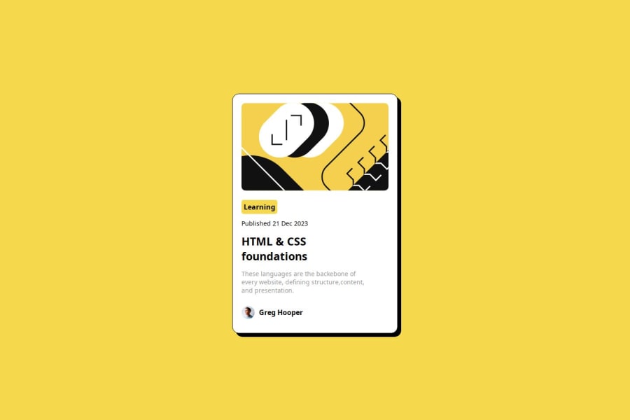
Design comparison
SolutionDesign
Solution retrospective
What are you most proud of, and what would you do differently next time?
I'm proud of the fact that i was able to complete this project on time.
What challenges did you encounter, and how did you overcome them?This project wasn't really challenging. From the knowledge i gained doing the QR-code component project, I was able to do this.
What specific areas of your project would you like help with?.
Community feedback
- @sivaprasath2004Posted 7 months ago
Hello, I would like to extend my congratulations on completing this challenge.
- The implementation of
main{ height: 100vh; }poses issues on mobile devices, extending beyond the boundaries of the main page. To address this, modify the code tomain{min-height: 100vh;}, ensuring a more suitable fit for mobile site viewing. - Additionally,
.card{ padding: 20px; }- I will recomand for Using rem values for padding provides a scalable and flexible approach, especially when considering accessibility and responsive design.
.container{
    padding: 2rem; //adjust size
}
0 - The implementation of
Please log in to post a comment
Log in with GitHubJoin our Discord community
Join thousands of Frontend Mentor community members taking the challenges, sharing resources, helping each other, and chatting about all things front-end!
Join our Discord
