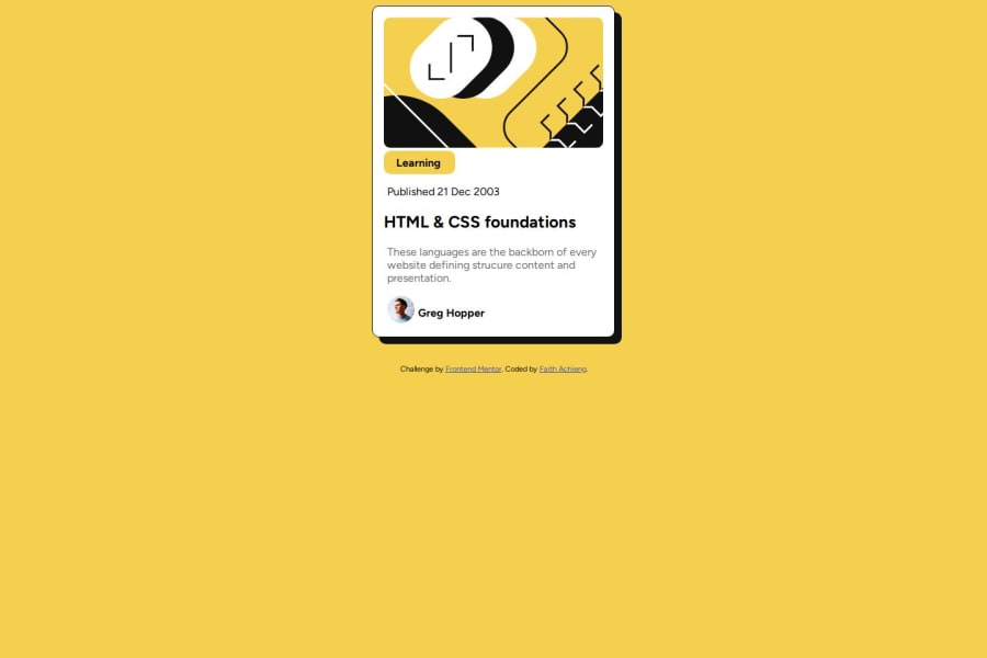
Design comparison
Solution retrospective
I am proud that I was able to complete this project without any assistance from my friends.
What challenges did you encounter, and how did you overcome them?Adjusting the margin for the blog preview card....I overcame this problem by reading about margins and understanding it.
What specific areas of your project would you like help with?Adjusting the margins. How to specify the padding for "Learning"
Community feedback
- @isibellsiaPosted 6 months ago
I think the container is too big, you did not follow the design pixels. The CSS is good.
Marked as helpful0 - @lrdelmarPosted 6 months ago
I would use margin when I need to add white-space below or above an element and always stick to either margin-top or margin-bottom for a project.
For the learning tag, instead of using margin try setting a % width instead. Move the padding from ".learning" to ".learning p".
I noticed a capital P on line 26 of your style.css which needs to be lower case. If you set the font-family to the body instead it will apply to all elements. Keep practicing and you'll get there :)
Marked as helpful0
Please log in to post a comment
Log in with GitHubJoin our Discord community
Join thousands of Frontend Mentor community members taking the challenges, sharing resources, helping each other, and chatting about all things front-end!
Join our Discord
