

Design comparison

Community feedback
- @Jyoti-shinde-coderPosted 19 days ago
The solution effectively uses semantic HTML, but replacing excessive <div> or <span> with proper tags can improve clarity and SEO. Accessibility can be enhanced by ensuring keyboard navigation, adding ARIA attributes, alt text for images, and maintaining good color contrast. The layout is responsive, but testing on different devices and refining image and text scaling can improve it further. Using CSS Grid/Flexbox helps with alignment. The code should be modular, well-commented, and follow best practices like DRY. Keeping styles and logic organized improves readability. Lastly, refining spacing, fonts, and alignment ensures the design closely matches the original. Overall, it’s a solid solution with minor improvements needed in accessibility, responsiveness, and structure.
Marked as helpful1P@Stash443Posted 15 days ago@Jyoti-shinde-coder All well said and taken into account. Thanks for the feedback.
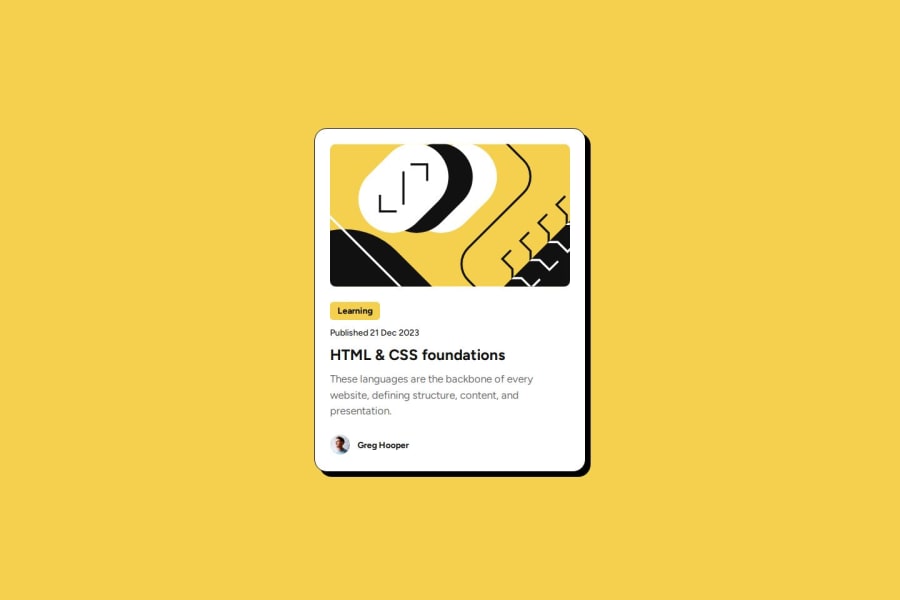
0 - P@mswirydowiczPosted 19 days ago
Hey!
Your image is too large. Look at project.
You haven't got <main>.
Why you touch img in div?
0P@Stash443Posted 15 days ago@mswirydowicz Hi there, I touch img in div because I wanted to control the image but then I realized it was unnecessary after doing research, mind you it was after I submitted the solution. For future projects I'll take the main tag into consideration.
1


Please log in to post a comment
Log in with GitHubJoin our Discord community
Join thousands of Frontend Mentor community members taking the challenges, sharing resources, helping each other, and chatting about all things front-end!
Join our Discord