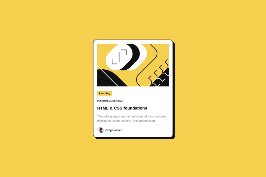
Design comparison
Solution retrospective
Coded on my mobile device. i'd appreciate any feedback. thanks!!
Community feedback
- @OmarRefaeePosted over 1 year ago
Well Done 👏 You Did Great, i have some suggestion for you that can make the project better:
- border-radius for the image.
- instead of using card-wrapper and container just center the card using body element:
body { min-height: 100vh; display: flex; justify-content: center; align-items: center; }- since you made media queries you need to make it more responsive add some work on mobile and medium screens and it will be perfect.
- better than using padding inside the card use:
.card {
    height: 520px;
    display: flex;
    flex-direction: column;
    justify-content: space-between;
}
and that's the feedback good luck in your career.
Marked as helpful1 - P@danielmrz-devPosted over 1 year ago
Hello @DonieCode!
Your solution looks excelent!
I have just one suggestion:
- In order to make your HTML code more semantic, use
<h1>for the main title instead of<h2>. Unlike what most people think, it's not just about the size and weight of the text.
📌 The
<h1>to<h6>tags are used to define HTML headings.📌
<h1>defines the most important heading.📌
<h6>defines the least important heading.📌 Only use one
<h1>per page - this should represent the main heading/title for the whole page. And don't skip heading levels - start with<h1>, then use<h2>, and so on.This change has little or not effect at all on the project, but it makes your HTML code more semantic, improving SEO optimization as well as the accessibility of your project.
I hope it helps!
Other than that, you did a great job!
Marked as helpful0 - In order to make your HTML code more semantic, use
Please log in to post a comment
Log in with GitHubJoin our Discord community
Join thousands of Frontend Mentor community members taking the challenges, sharing resources, helping each other, and chatting about all things front-end!
Join our Discord
