Design comparison
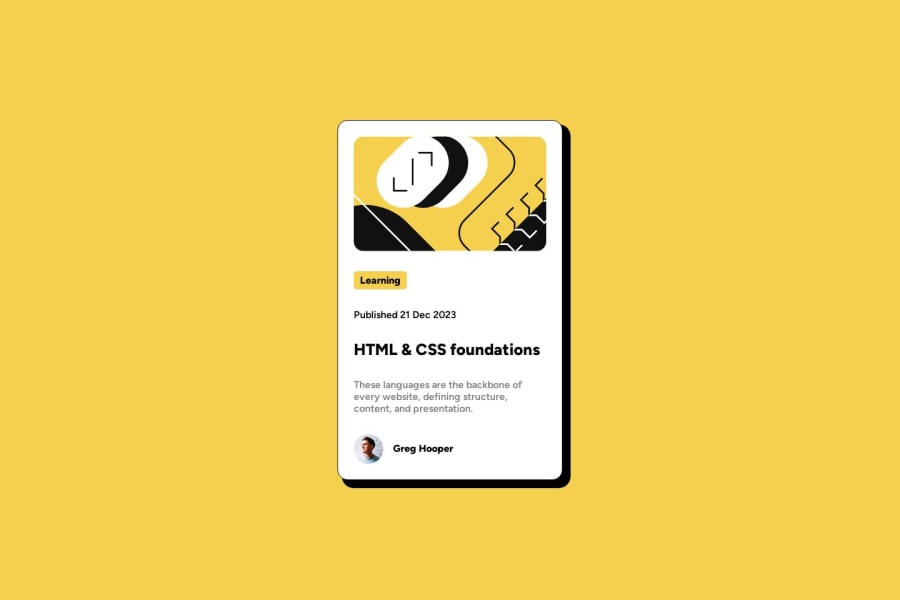
SolutionDesign
Solution retrospective
Is there a standard on how to organize and name CSS? Also, sometimes my text spacing is off depending on the screen size. Is there a way to make text sizes more responsive asides from media queries?
Community feedback
- @danielmrz-devPosted 10 months ago
Hello Celine!
Your solution looks awesome!
About your question:
- Another option is using the
clamp ( )method in your coding for font-size, width, margins, padding, etc., So the designed sizes will change according to the viewport dimensions having a responsive design and will be suitable for any device layout.
Hope it helps!
And Happy New Year! 😁
1 - Another option is using the
Please log in to post a comment
Log in with GitHubJoin our Discord community
Join thousands of Frontend Mentor community members taking the challenges, sharing resources, helping each other, and chatting about all things front-end!
Join our Discord

