Submitted 7 months ago
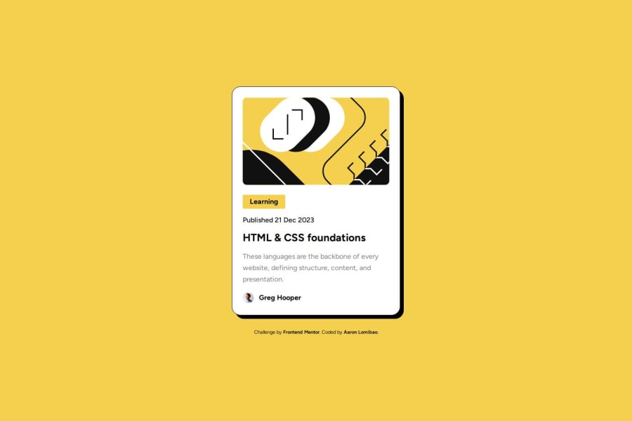
Blog preview card using basic HTML and CSS with BEM methodology
@AaronL9
Design comparison
SolutionDesign
Solution retrospective
What are you most proud of, and what would you do differently next time?
I'm proud that I applied BEM methodology in this project.
What challenges did you encounter, and how did you overcome them?The challenges I encounter is to get the right spacing and make the image scale down without losing its height ratio. I used flexbox to get the right spacing using gap property and to make the height of the image consistent, I just set the height to 200px using absolute units such as px.
What specific areas of your project would you like help with?I would like to get help with methodology if I used it correctly. I'm open to any criticism of how I code or build the project. any help will be appreciated.
Community feedback
Please log in to post a comment
Log in with GitHubJoin our Discord community
Join thousands of Frontend Mentor community members taking the challenges, sharing resources, helping each other, and chatting about all things front-end!
Join our Discord
