Design comparison
Solution retrospective
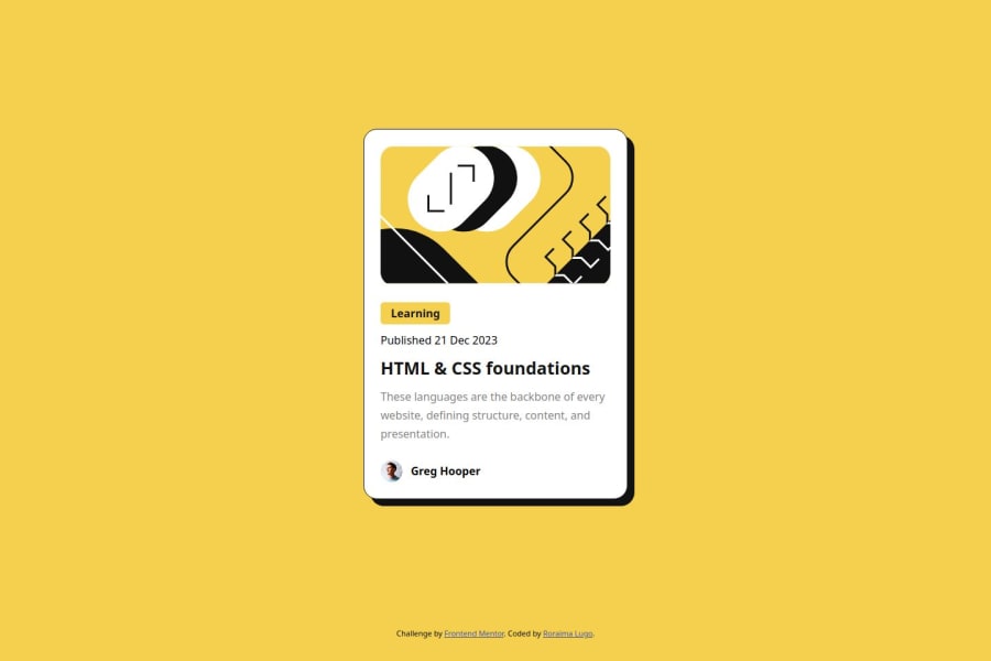
Thanks to Figma's design, I think I managed to make the design as accurate as possible.
What challenges did you encounter, and how did you overcome them?This design is very good for those who are taking their first steps as a developer. For me it was relatively easy.
What specific areas of your project would you like help with?I am ok
Community feedback
- @DanCodeCraftPosted 9 months ago
Looks very similar to the original. Only when I open on different screen sizes, the title of the card is either in one or two lines, depending on how wide the monitor I'm looking at is.
Other than that, it seems very good!
Marked as helpful0@roraima1986Posted 9 months ago@DanCodeCraft
Thank you very much for your observations. I resolved the title issue as you suggested.0 - @grace-snowPosted 9 months ago
Hi I hope this is helpful
This looks good overall but I would definitely recommend some improvements to css and I think you need to give more consideration to context and performance. I'll try to explain in feedback...
- you are loading 3 separate css files. That's 3 server calls for what should only be one.
- think about the context of where this component would be used on a site. It is not a full Web page, just a single card component, likely to sit alongside other blog cards. That means it should not be a main landmark, it should be inside the main landmark.
- it also means the img alts must either be descriptive to this specific content, or should be blank if you consider the img decorative content. It is worth reading the excellent article about alt text on the resources channel on discord.
- it also means this card must not have a h1. The h1 element is for a page heading. This card wouod sit lower on a page, likely alongside similar cards, so should be a h2.
- I strongly recommend against changing the html font size to make 1rem equal 10px. I've explained why this is a bad idea in a dedicated post
- Get into the habit now of always including a modern css reset at the start of the styles in every project. Andy Bell has a good one you can look up and use.
- don't set a width on the layout or component. There is no need. All this component needs is a single max width in rem. This allows the component to shrink narrower when it needs to. There is actually no need for the extra layout styles at all. The body can have some padding so the component doesn't hit screen edges.
- the whole card should not have a hover style unless the whole card is clickable. To make the whole card clickable you would use a pseudo element attached to the title link, as explained on the inclusive components site
- there is no need for a media query in this at all. But in future challenges when you do need one, remember core principles: Style mobile first. So mobile layout is always the default styles unless it is significantly more complex than the desktop layout. (That's rare though - complex mobile navigation or data tables are the only examples I can think of where a desktop approach can make better sense). And when you write media queries they must be defined in rem or em not px. That is important so all users get a good layout, even if they have a different default text size. I've written a post about using media queries well that is worth you reading.
0
Please log in to post a comment
Log in with GitHubJoin our Discord community
Join thousands of Frontend Mentor community members taking the challenges, sharing resources, helping each other, and chatting about all things front-end!
Join our Discord