Design comparison
Community feedback
- @Tanuja0530Posted 7 months ago
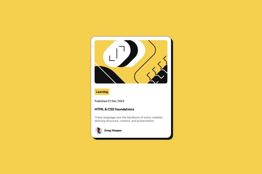
Your use of semantic HTML elements is excellent, which improves both accessibility and the structure of your content. Consider adding descriptive labels to interactive elements for even better screen reader support.The layout adapts well across different screen sizes. However, you might want to adjust padding and margins on smaller screens to prevent content from feeling cramped.Your code is well-structured and easy to read. To improve maintainability, consider using CSS variables or a preprocessor to reduce repetitive styles.Your solution closely matches the original design, showing attention to detail in typography and spacing. Great job on maintaining design consistency!
1
Please log in to post a comment
Log in with GitHubJoin our Discord community
Join thousands of Frontend Mentor community members taking the challenges, sharing resources, helping each other, and chatting about all things front-end!
Join our Discord
