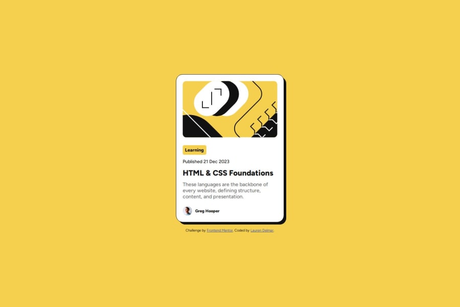
Design comparison
Solution retrospective
I took on the feedback from my previous solution and applied most of it so now it is fully responsive. I also cleaned up my HTML as there were some errors in there. In my next challenge I will look into applying a modern CSS reset.
What challenges did you encounter, and how did you overcome them?When I applied the changes it impacted the layout. I was able to do a little research using stackoverflow and the Discord channel. By applying flex to the container the footer appeared at the bottom. I also updated values that were in px to rem for better responsiveness.
What specific areas of your project would you like help with?I am working towards being a front-end web developer so if there are any tips you have or issues still with my code then I would appreciate your feedback so that on my next projects I can implement these changes
Community feedback
Please log in to post a comment
Log in with GitHubJoin our Discord community
Join thousands of Frontend Mentor community members taking the challenges, sharing resources, helping each other, and chatting about all things front-end!
Join our Discord
