Design comparison
Community feedback
- P@jedcancholaPosted 6 months ago
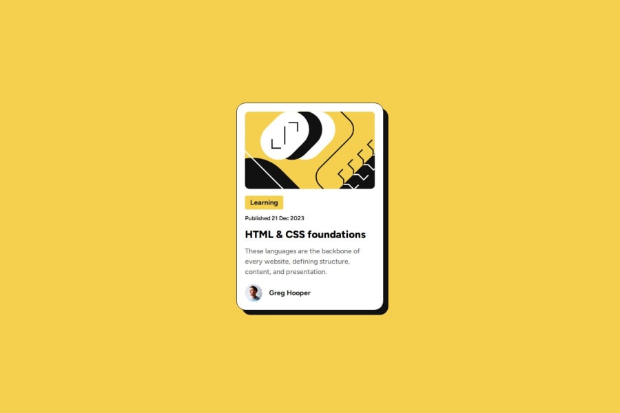
Semantic HTML was used but could have been better by implementing an article as a card, and define a main and footer within the card.
The Image is accessible and used the correct alt description.
The different screen sizes were not implemented, the image and fonts are static, from the design fonts and size should be different depending on the screen size.
The code is well structured but I think a different approach should be used with the SVG as it takes a lot of the space on the html.
It only differ from the design in the size.
Marked as helpful0@fincodewizPosted 6 months ago@jedcanchola Thank you for taking the time to provide your feedback. Your insights are valuable and help me to improve.
0
Please log in to post a comment
Log in with GitHubJoin our Discord community
Join thousands of Frontend Mentor community members taking the challenges, sharing resources, helping each other, and chatting about all things front-end!
Join our Discord
