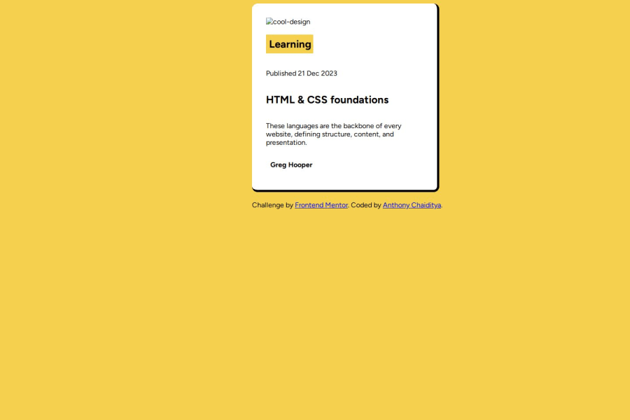
Design comparison
Solution retrospective
I think I am most proud of the speed with which I was able to do this - however, I would have liked to make the code responsive, and I feel like I am still not optimizing the way I structure my html and css, so if I were to go back, I would actually approach the challenge more slowly to optimize for cleaner code.
What challenges did you encounter, and how did you overcome them?I had issues with selecting and sizing - and I feel like it has to do with how I am structuring my html and connecting it with my css. There were times where I would want to adjust the styling of the avatar and name but when I would add styling, the size of the picture would change and I am not sure why. In addition, the pictures are not loading on the live site.
What specific areas of your project would you like help with?I would like help with understanding the best way to structure HTML in the project, and the approach to styling with css.
Community feedback
- @siyad01Posted 11 months ago
hello here, your images are not commited in github repo you can center the component by: display:flex; justify-content:center; height:100vh; text-align:center; on class container. feel free to txt in case of any queries Happy coding
0 - P@merwhite11Posted 11 months ago
Nice work Anthony !
Images I think the reason the images aren't loading has do with a pathway error. Try it with a period before the pathway to the file:
./assets/images/illustration-article.svgSelecting HTML els for CSS styling What could help out here is using more class names so you can create more specific elements and apply custom stylings: https://developer.mozilla.org/en-US/docs/Web/HTML/Global_attributes/class
Sizing You can use flex box on the entire body to center the card on the page. That way you can avoid hard-coding in the margin-left.
You can create containers around elements with a fixed height, then you can let the nested element scale within those dimensions.
I've recently been working with BEM to help make css more readable: https://getbem.com/
Next step would be to try SCSS so you can nest stylings, also helps with readability: https://sass-lang.com/
Have fun with the next challenge 😊
0 - P@kodan96Posted 11 months ago
hi there! 👋
- your image is not showing up, you can try to start your path with a
.. So your source attribute should look like this:
src="./assets/images/illustration-article.svg"- and you can center your content if you apply these to the
bodytag:
body { min-height: 100vh; display: flex; justify-content: center; align-items: center; }- HTML structure and styling comes together, especially when it comes to using Flexbox, you should separate your elements within the container based on the desired layout. of course you should use semantic tags instead of
div-s if that's possible.
Hope this helped 🙏
Good luck and happy coding! 🤙
0 - your image is not showing up, you can try to start your path with a
Please log in to post a comment
Log in with GitHubJoin our Discord community
Join thousands of Frontend Mentor community members taking the challenges, sharing resources, helping each other, and chatting about all things front-end!
Join our Discord
