Design comparison
SolutionDesign
Solution retrospective
What are you most proud of, and what would you do differently next time?
Proud of finishing fast
Community feedback
- @AuroreLPPosted 6 months ago
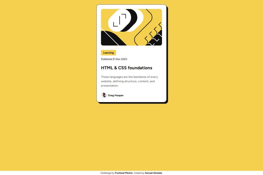
It looks good and the mobile version is great. It would have been perfect if the card was centered. Plus, I may have misunderstood, but I thought we couldn't use Media Queries to make this project responsive, which is why I struggled. Regarding your code, I can see you didn't use only HTML and CSS, so you definitely have a more advanced level than me. So if you did that very fast, congratulations!
0
Please log in to post a comment
Log in with GitHubJoin our Discord community
Join thousands of Frontend Mentor community members taking the challenges, sharing resources, helping each other, and chatting about all things front-end!
Join our Discord
