

Design comparison
SolutionDesign

Community feedback
- @StergiosHariopPosted 22 days ago
Hey mate! You can make some improvements here :
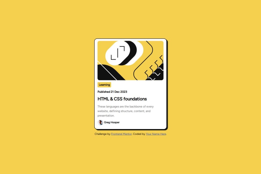
- Check again the designs, your card is not responsive. You should fix the width for mobile screen as its not aligned with the design for the mobile version. Check the paddings and font sizes in the Figma file.
- You paddings and gaps are not aligned with the design for the desktop version. Padding for the container should be 24px.
Overall you re pretty close to the design. Keep practicing and pay close attention to the Figma Design file.
Good job
0 - @AilaFelixxPosted 22 days ago
Hi, Seseshe. Wanna an advice? Try use more margin on the elements, adjust the weight of the words and delete this paragraph under the card. The "published" part need to be more lighter ad the border more lighter too. Your project is really good. Keep going :)
0


Please log in to post a comment
Log in with GitHubJoin our Discord community
Join thousands of Frontend Mentor community members taking the challenges, sharing resources, helping each other, and chatting about all things front-end!
Join our Discord