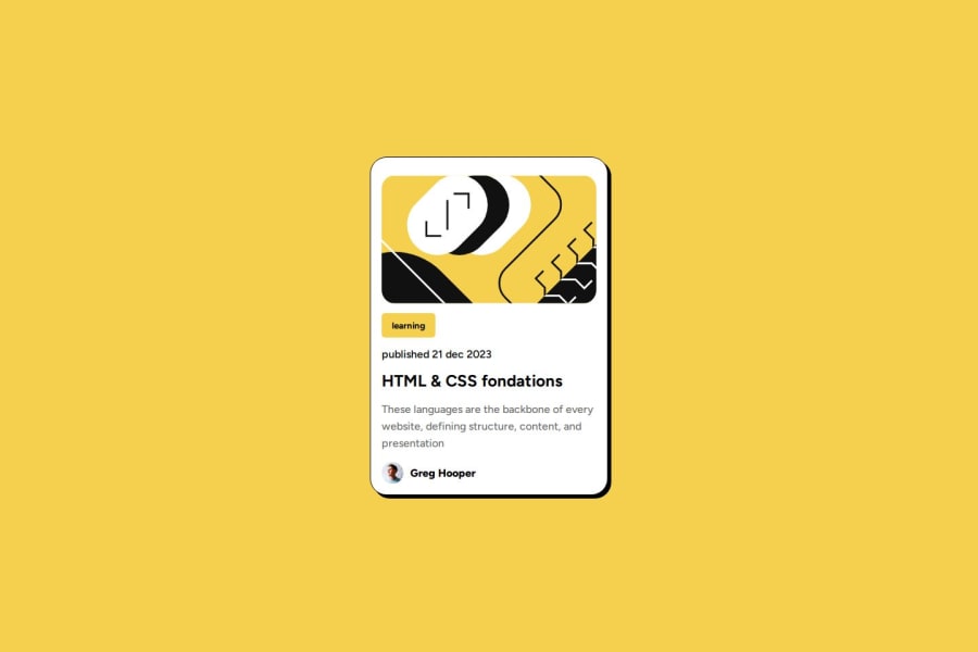
Design comparison
Solution retrospective
I’m proud of the clean code structure, responsive design, and creative use of SVGs. Next time, I’d focus more on accessibility, optimizing the SVG, and refining hover effects.
What challenges did you encounter, and how did you overcome them?I encountered challenges with centering elements, adding margins to the img-box, and making the SVG look like the design. I overcame these by adjusting padding and margins through trial and error, and refining the SVG styling to match the layout.
I would like help with improving the responsiveness of the card design, particularly ensuring the SVG scales perfectly across all screen sizes. Additionally, I want feedback on how to optimize my CSS code to make it more concise and maintainable while preserving the design.
Community feedback
- @Joshk7Posted 22 days ago
Hi there, nicely done. I looked at your html file and you could link to a css file in the head tag of index.html
<link rel="stylesheet" href="./style.css" />The use of svgs for images is a nice touch but an image tag would be simplest:
<img />I like the use of box-sizing: border-box because it makes styling much easier.
However, you could change the sizings wherever you have px to that number of pixels divided by your root font-size to calculate rems. In my solution (24px = 24 / 16 = 1.5rem) this helps make your solution look better on mobile.
An example that could make this project better is with border radius. You could set it to 20px / 16px or 1.25 rem.
Lastly, you can use a css reset to make starting a project much easier: https://www.joshwcomeau.com/css/custom-css-reset
Marked as helpful0
Please log in to post a comment
Log in with GitHubJoin our Discord community
Join thousands of Frontend Mentor community members taking the challenges, sharing resources, helping each other, and chatting about all things front-end!
Join our Discord
