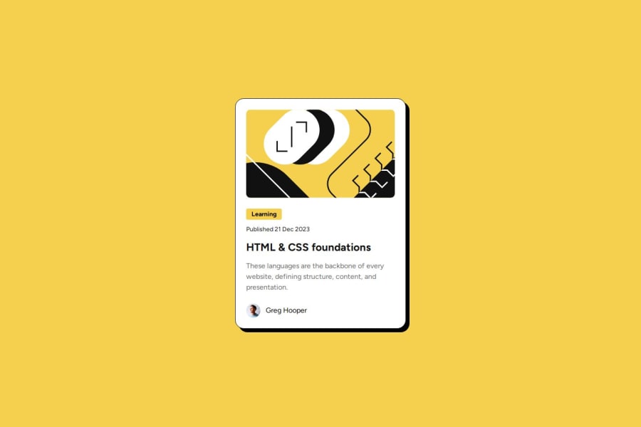
Blog Preview Card Solution using HTML and CSS
Design comparison
Solution retrospective
These 2 projects has really helped me to learn the rules that I need to follow for creating a project in frontend Mentor.
What challenges did you encounter, and how did you overcome them?Encountered challenge with using boxShadow for the card.
What specific areas of your project would you like help with?Please go through my project and let me know on the areas that I can improve.
Community feedback
- @grace-snowPosted 5 months ago
The same feedback I've just left on your previous solution applies here so I won't repeat.
There's one really important extra consideration you've missed in this challenge though: the link. The design shows this card is meant to be clickable, but you've not included the essential interactive element, instead adding hover styles to non-interactive elements. This makes the whole component non-functional (I.e. Pointless! When it's purpose is to link to a blog).
Once the link has been added inside the heading, you'll need to make the whole card clickable. A common way to do that is by making the card position relative and adding a pseudo element to the link that covers the card with position absolute. Now tye clickable area of the link will cover the card.
The only other problem I see is the max-width 25% on the tag/category. You need to remove that. It will cause overflow for some users. Let the width of the category/tag be defined by its content and padding only. There's no need for a width or max-width.
Lastly, there's no need for a media query in this challenge. You can remove it all. Leave the font sizes as the default and don't worry about changing anything.
0@grace-snowPosted 5 months agoI've just noticed another recommendation: styling on single class selectors keeps css specificity low and means when you have to change html (which happens a lot more often than you think in real projects!) the styles won't break. Currently where you are using
.class elementselectors that can lead to fragile css that's harder to maintain on larger projects or team environments.0@Lokesh8055Posted 5 months ago@grace-snow,
Thanks for these suggestions I have made the changes can you please check once again
0@grace-snowPosted 5 months ago@Lokesh8055 have a look through the feedback again. The most important problem of all isn't fixed yet.
And it doesn't look like you've fixed image alts either (see feedback on previous challenge).
0@grace-snowPosted 5 months ago@Lokesh8055 The most important issue is still not fixed. This blog card is non-functional.
0@Lokesh8055Posted 5 months ago@grace-snow , can you check now I have made entire card clickable
0@grace-snowPosted 5 months ago@Lokesh8055 You are still not understanding.
There is no link in this card yet. There must be a link inside the h2. The link text is the blog title.
The pseudo must be attached to the interactive element, not a non-interactive one.
This card is not yet "clickable". It won't work for anyone, especially keyboard users without the link being present in html.
Also, I think you've misunderstood alt text on these images. Both images are not adding any meaningful content to this card. They should be treated as decorative. The alts should be empty, not longer. (But you have understood how to write alt text when you need to in future so the learning is still valuable for other challenges)
0
Please log in to post a comment
Log in with GitHubJoin our Discord community
Join thousands of Frontend Mentor community members taking the challenges, sharing resources, helping each other, and chatting about all things front-end!
Join our Discord
