

Design comparison

Community feedback
- @DudeldupsPosted 3 months ago
Hello Robel!
Your solution looks good on larger screen sizes but not so good on mobile screens. The go-to is to account for screens with a width from 320px up. Your containers use a fixed width, which is generally not good. Let the elements take up the space that they need - that's what makes your site responsive. If you give the outer container and the card a
max-widthinstead of a fixed width, then you should already see what I mean.Furthermore I advise you to go through the learning paths here on FEM or reading the MDN documentation about the main rules of semantic HTML. Your site should have a
<main>element and since there is no<header>provided by the challenge, you could have just left it out for this one, but the attribution fits perfectly inside a<footer>element (sibling to the <main>)Also there are general rules for CSS which you should look at again: Do not declare font-related CSS styles in
px, this makes the website inaccessible to people that declared a custom font-size in their browser. Usingremaccounts for that.Another quick tip from my side, it's generally easier and more common to use (min-width) media queries, so going "mobile-first". On larger layouts you'll have it easier, because stuff just stacks on top of each other in mobile views most of the time. This is the default behavior of block elements. Then you only have to add min-width media queries for larger screens to add the neccessary styles. 😀
I strongly advise you to go through your code and look at it again to fix at least the stuff I pointed out and also re-test your site with the help of the developer tools of your browser for different screen sizes. You should at least use Firefox and Chrome to ensure it works for most of the users.
Hope this helps, happy coding 👾
Marked as helpful0@Rapbit27Posted 3 months ago@Dudeldups Thank you so much for the detailed feedback!! If you hadn't pointed out those issues now I would have proceeded with faulty habits. I will try to apply them to all my projects from now on.
I have also made some adjustments to the code, and I would love to hear your feedback on it.
Again, thank you!!
0@DudeldupsPosted 3 months ago@Rapbit27 Nice! Now you can see that the card behaves like "you want it to" 😄
BTW, you can also look at the
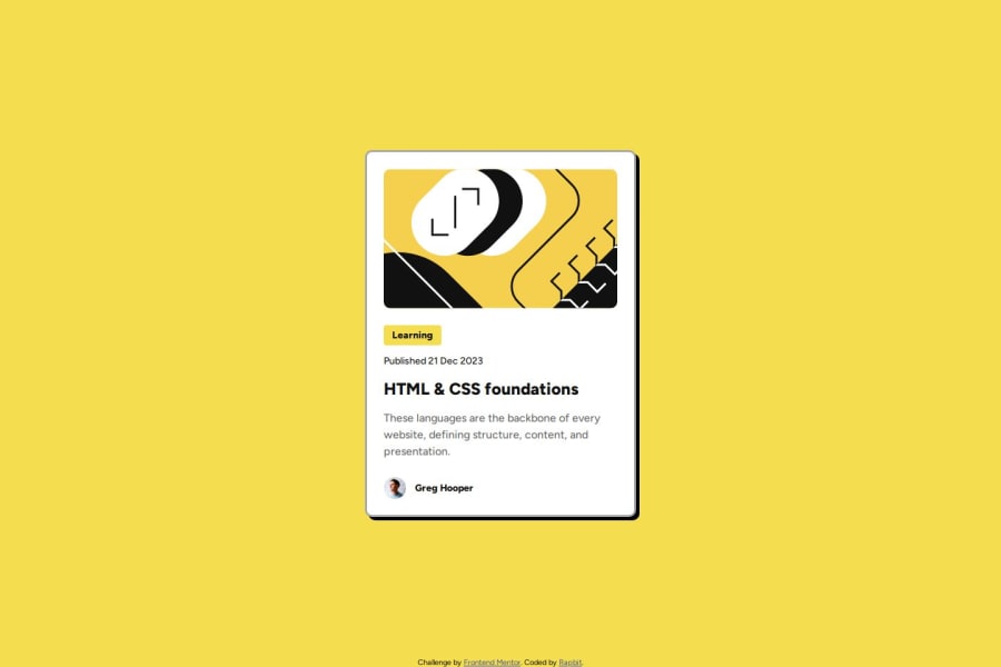
altattribute of the image, I think if a visually impaired user hears "illustration" as the image's description it doesn't really help them. If you have decorative images like this one, you can leave thealtattribute blank so assistive technology like screen readers know they can ignore it. This also applies to a "proper" image that is already explicitly described by the text beside/beneath it. On the other hand, if you had a meaningful image here that is not described by the card's content, you have to add analtdescription. 🤯😄0

Please log in to post a comment
Log in with GitHub
Join our Discord community
Join thousands of Frontend Mentor community members taking the challenges, sharing resources, helping each other, and chatting about all things front-end!
Join our Discord