Not Found
Not Found
Not Found
Not Found
Not Found
Not Found
Not Found
Not Found
Not Found
Not Found
Not Found
Not Found
Not Found
Not Found
Not Found
Not Found
Not Found
Not Found
Not Found
Not Found

Submitted

Blog preview card solution using CSS

@Marvie-03

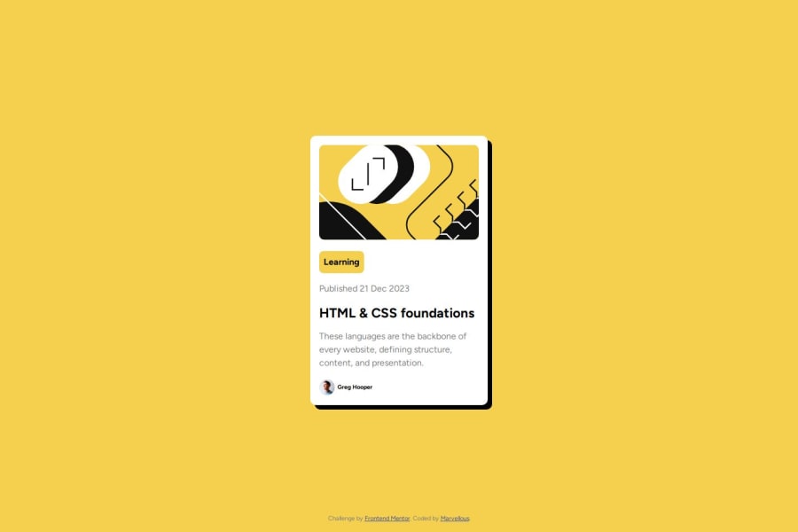
Desktop design screenshot for the Blog preview card coding challenge

This is a solution for...

  • HTML
  • CSS
1newbie
View challenge

Design comparison


SolutionDesign

Solution retrospective


What are you most proud of, and what would you do differently next time?

I'm excited to have used var() function in CSS. I'm looking forward to utilizing more of it in future projects

What challenges did you encounter, and how did you overcome them?

The CSS positioning Syntax, I had to check W3Schools materials to remember

What specific areas of your project would you like help with?

The responsiveness. if you are reading this, how responsive is it on your device

Community feedback

Tharun Raj 1,250

@Code-Beaker

Posted

Hi there, congratulations on completing this challenge. You've done a great work with this challenge! 🎉

I would like to share some of my suggestions regarding your website that might help you improve it.

  • This is optional, but having a small transition would improve the box-shadow hover effect of the card.
  • The heading levels should only decrease by one or if you're using an h1 in your document, then the next heading must be an h2. I noticed this issue with your document here:
<div class="card">
  <h2 class="card-title">HTML & CSS foundations</h2>
  <div class="user-details">
     <img src="assets/images/image-avatar.webp" alt="User Image" />
     <h6>Greg Hooper</h6> <!--  The heading level jumps from h2 to h6 -->
  </div>
</div>

When you're aiming to create a small text element, either use a p tag or style a heading using CSS. That might be a better option. If you wish to learn more about this, read this StackOverflow Page

Overall, you've done an impressive work. These small changes would make it more accessible and visually better.

Hope this helps you. 😃

Marked as helpful

0

@Marvie-03

Posted

@Code-Beaker It indeed helped, I have added a transition to the card element, and followed the semantic guideline. you can go over it again.

1
Tharun Raj 1,250

@Code-Beaker

Posted

Glad I was able to help, @Marvie-03

I noticed an issue with the image. This might be due to the max-width: 100% that is applied to the img.

I tried editing the styles of the .card with my developer tools and changed the max-width: 20rem and it seems fine. The improvements you've made are noticeable. Good job 😊

0

@Sadikibenda

Posted

nice shot !!! I will try using var() next time on my project as well, I really never thought about it. also, try using flexbox to play with responsiveness on your next project.

well done Modupe.

0

@Marvie-03

Posted

@Sadikibenda I will try flexbox as soon as i can. Thank you

0

Please log in to post a comment

Log in with GitHub
Discord logo

Join our Discord community

Join thousands of Frontend Mentor community members taking the challenges, sharing resources, helping each other, and chatting about all things front-end!

Join our Discord