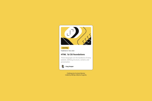
Blog preview card solution using

Solution retrospective
This project are fun!
Yes I really enjoy to finish this project because I also work at a construction company at the moment. It's so exhausting to think about my construction project, but THIS project are really fun and simple.
I also try to use Tailwind CSS in this project and I face some problem when I use flexbox to styling the position of main card. So I just simply move to grid this time.
Also I still figuring out why the drop shadow did'nt show at the main card. If you can help me with it please leave a comments!
Keep grinding bro!💪🏻
What challenges did you encounter, and how did you overcome them?I got problem with Tailwind CSS in flexbox and drop shadow. Sometimes it just don't want to appear in my style. But when I manually inspect it and add vanilla CSS via inspect element, the bugs are solved. So for now I still figure it out how to solve this problem.
What specific areas of your project would you like help with?Is there any good and easy workflow to use Tailwind CSS in your project? I still confuse with the workflow to use Tailwind CSS.
Please log in to post a comment
Log in with GitHubCommunity feedback
No feedback yet. Be the first to give feedback on Adhitya Aditama Nugraha's solution.
Join our Discord community
Join thousands of Frontend Mentor community members taking the challenges, sharing resources, helping each other, and chatting about all things front-end!
Join our Discord