Design comparison
SolutionDesign
Solution retrospective
Hello 👋
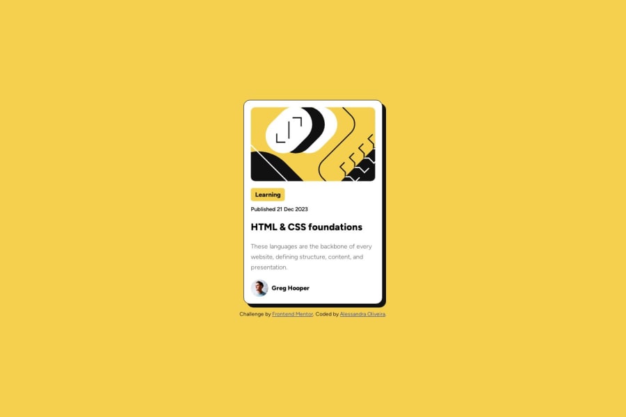
This is my solution to the Blog Preview Card Challenge.
(The sizes might be a little different, I can't be sure of the original scale.)
Feedbacks are welcome
Community feedback
- @AGutierrezRPosted 10 months ago
Hello there 👋. Good job on completing the challenge!
I have some suggestions about your code that might interest you.
General Structure and HTML:
- Consider using
<h2>instead of<p>for elements that are titles, like the title of the card. The "HTML & CSS foundations" is the title - Consider using
<span>or<time>instead of paragraphs for elements that are not actual paragraphs like "Learning" and "Published...".
CSS and Styling:
- Implement CSS custom properties to define and utilize project colors more easily.
- Instead of fixed widths, employ
max-widthandmin-widthfor flexible and responsive design.
Accessibility and Semantic HTML:
- Profile image could benefit from a more descriptive alt text, like
alt="Headshot of Greg Hooper". - Maintain semantic HTML structure by using appropriate elements for their intended purposes.
I hope you find this helpful 😁. Most importantly, your submitted solution is fantastic!
Happy coding!
Marked as helpful1 - Consider using
Please log in to post a comment
Log in with GitHubJoin our Discord community
Join thousands of Frontend Mentor community members taking the challenges, sharing resources, helping each other, and chatting about all things front-end!
Join our Discord
