Design comparison
Solution retrospective
Hello everyone,
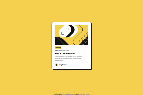
I am Namrata and this is my solution for the Blog preview card challenge.
If you have any suggestions to improve my code, please feel free to share!
Thank you š
Community feedback
- @danielmrz-devPosted 10 months ago
Hello @nmrtsnh!
Your solution looks excelent!
I have just one suggestion:
- In order to make your HTML code more semantic, use
<h1>
for the main title instead of<p>
. The tag<p>
is meant for paragraphs. For titles, we have the HTML headings (<h1>
to<h6>
). Unlike what most people think, it's not just about the size and weight of the text.
š The
<h1>
to<h6>
tags are used to define HTML headings.š
<h1>
defines the most important heading.š
<h6>
defines the least important heading.š Only use one
<h1>
per page - this should represent the main heading/title for the whole page. And don't skip heading levels - start with<h1>
, then use<h2>
, and so on.This change has little or not effect at all on the project, but it makes your HTML code more semantic, improving SEO optimization as well as the accessibility of your project.
I hope it helps!
Other than that, you did a great job!
Marked as helpful0 - In order to make your HTML code more semantic, use
Please log in to post a comment
Log in with GitHubJoin our Discord community
Join thousands of Frontend Mentor community members taking the challenges, sharing resources, helping each other, and chatting about all things front-end!
Join our Discord