

Design comparison
SolutionDesign

Solution retrospective
What are you most proud of, and what would you do differently next time?
I used "rem" a lot of times, rather than "px". Makes it more accessible and responsive. Also, I like my CSS sorting. Going from top to bottom, parent to child seems like a nice way of doing it.
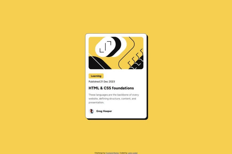
What challenges did you encounter, and how did you overcome them?It took me some time to figure out how to limit the background color of "Learning" to its text length. I solved it using <span>.
What specific areas of your project would you like help with?Do you think my code is easy to follow? Any suggestions for making it cleaner?
Community feedback
Please log in to post a comment
Log in with GitHubJoin our Discord community
Join thousands of Frontend Mentor community members taking the challenges, sharing resources, helping each other, and chatting about all things front-end!
Join our Discord