Design comparison
Solution retrospective
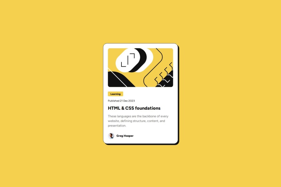
Tried to use Semantic HTML5 elements again. I am getting good probably. This time mobile first workflow was problematic (I think). The provided design images had different card
width on mobile and desktop. Also all the elements had different properties too. I only noticed that after finalizing everything (in my mind). Then added some media query 😄. Also tried using BEM class naming format.
Community feedback
- @AndrooFrownsPosted 4 days ago
Looks really nice, I don't think I have any comments in particular about the appearance.
In terms of semantic HTML you may want to consider using the
<img>
tag and the<author>
tag. (I'm also getting used to semantic html elements so I might be wrong about using them, so take it with a grain of salt.)BEM style looks pretty organized, maybe I'll need to try it.
You might be interested in learning about "CSS Generated Content" to for example add the "Published" word from CSS rather than by adding it to the Html.
Also, I'm not sure if it's itentional but your info at the bottom of the page involves scrolling slightly and still has the white background.
Marked as helpful0@wren3nPosted 4 days ago@AndrooFrowns HI. Thanks for your response!
CSS generated content is interesting. I will try it on my next project.
About the "attribution" section at the bottom. Yes it is intentional. I will make it better on the next project as well.
0
Please log in to post a comment
Log in with GitHubJoin our Discord community
Join thousands of Frontend Mentor community members taking the challenges, sharing resources, helping each other, and chatting about all things front-end!
Join our Discord