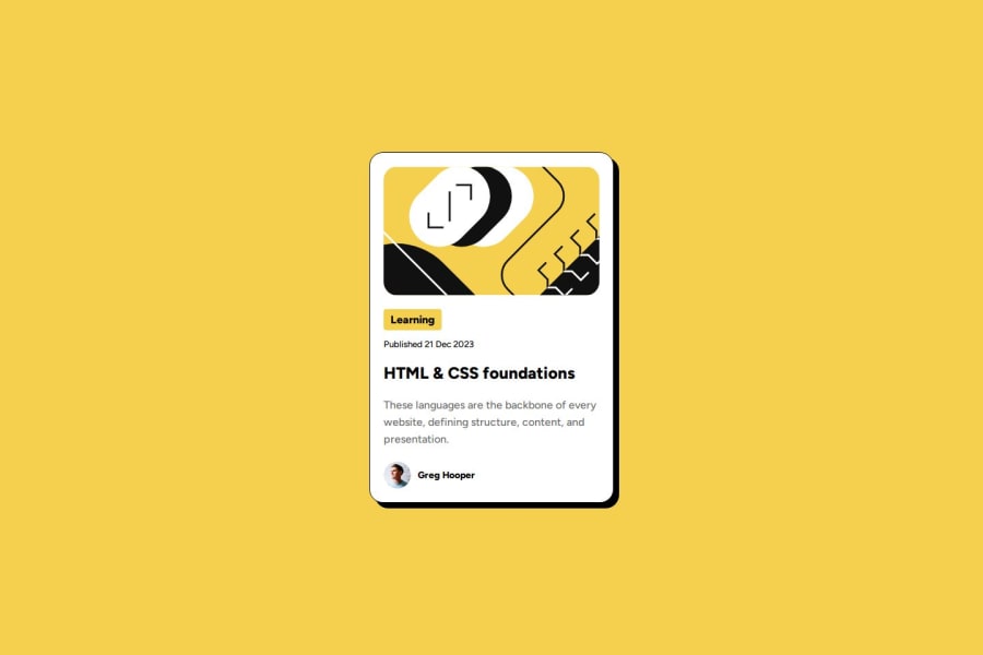
Design comparison
SolutionDesign
Solution retrospective
What are you most proud of, and what would you do differently next time?
I'm proud that I was able to finish this solution at a time shorter than expected. Even though this is not part of the solution, it would be cool to add animations around the card that displays all the information. Maybe something that shines the container or a light that traverses around it.
What specific areas of your project would you like help with?Honestly, didn't have much problems with this one but feedback is always welcome. There is always a more optimal solution and if anyone can find one, please send!
Community feedback
Please log in to post a comment
Log in with GitHubJoin our Discord community
Join thousands of Frontend Mentor community members taking the challenges, sharing resources, helping each other, and chatting about all things front-end!
Join our Discord
