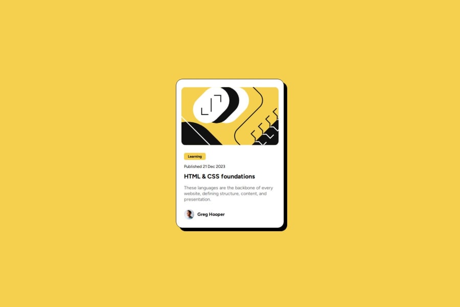
Design comparison
Solution retrospective
I will do further research into em and rem units to make my life a little bit easier in the future, as it still confuses me a little bit.
What challenges did you encounter, and how did you overcome them?I struggled with sizing the image on this preview. The solution for this was to switch from px to em units, as it allowed for the container and items to sit within each other without worrying about exact spacing.
Please log in to post a comment
Log in with GitHubCommunity feedback
- @Grimm-N
Great Job on Your Code!
I really appreciate the effort you’ve put into this project! Here are a few tips that might help enhance your code further:
-
Use of rem and em Everywhere:
- It's essential to use
remandemunits consistently throughout your code. While it might feel inconvenient at first, you'll quickly adapt, and in the end, it leads to cleaner, more maintainable code. These units are responsive and ensure that your layout scales well on different devices, making it more user-friendly.
- It's essential to use
-
Simplifying Styles with Padding:
- To simplify your styles, consider setting a padding for the entire card rather than adjusting the margins for each individual element. This approach will help maintain uniform spacing and reduce redundancy in your CSS. For example:
.card {
    padding: 1.5rem; /* Sets a consistent padding for all inner elements */
}
- To simplify your styles, consider setting a padding for the entire card rather than adjusting the margins for each individual element. This approach will help maintain uniform spacing and reduce redundancy in your CSS. For example:
-
Avoid Positioning for Simple Layouts:
- I recommend avoiding positioning for such simple tasks. You can achieve the desired layout using
flexorgrid, which makes your code more straightforward and easier to manage.
- I recommend avoiding positioning for such simple tasks. You can achieve the desired layout using
-
Adhering Closely to Design Specifications:
- Strive to keep your sizes and placements as close to the design specifications as possible. This practice not only fosters consistency but also helps us learn how to overcome challenges effectively, making us better developers in the long run.
-
Getting Comfortable with hsl and hsla Colors:
- Lastly, I advise you to get accustomed to using
hslandhslacolor formats. These formats provide more flexibility when adjusting colors, and they help prevent mistakes with shades when converting between formats.
- Lastly, I advise you to get accustomed to using
Keep up the fantastic work, and I’m excited to see your progress! Your dedication is truly inspiring!
Marked as helpful -
- @ujwal282
nice
Join our Discord community
Join thousands of Frontend Mentor community members taking the challenges, sharing resources, helping each other, and chatting about all things front-end!
Join our Discord

