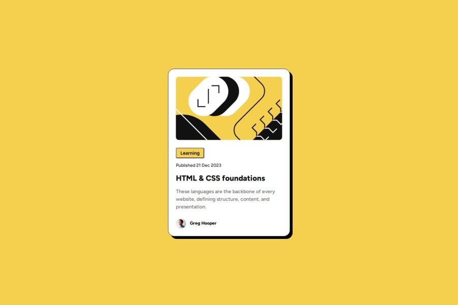
Design comparison
SolutionDesign
Community feedback
- @NeoV10Posted 4 months ago
I think there´s a lot of css code that it´s not necessary. The mobile designs is ok, but when the screen gets smaller the card brokes. I see a lot of unnecessary classes in the HTML code even if they are being used in the css code.
0
Please log in to post a comment
Log in with GitHubJoin our Discord community
Join thousands of Frontend Mentor community members taking the challenges, sharing resources, helping each other, and chatting about all things front-end!
Join our Discord
