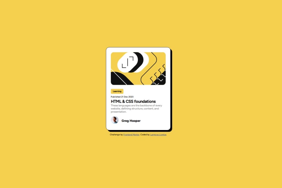
Design comparison
Solution retrospective
I'm getting the hang of writing the HTML so that the flexboxes can be configured for correct spacing. I am also using *, and :root for items I expect to exist throughout the document, as well as @font-face to add the custom fonts.
The big challenge is still getting the hang of using Flexboxes so that there are containers in which to position page elements; I'm still bumping into too many cases where I forget to add a container, and then wonder why an element won't center (vertically or horizontally).
I'd like to say I had an aha moment, but at this time, it's just good, old-fashioned practice, practice, practice!
What specific areas of your project would you like help with?At the moment, it's too early to ask for help; I'm not yet out where there are difficult challenges, just silly stuff that I know the answers to, if I just step back and look for a minute.
Community feedback
- @mohad12211Posted 11 months ago
your spacing is good, but some dimensions are not the same as the figma design
0@reteovPosted 11 months ago@mohad12211 I've not really used Figma; I'm watching my dollars, so I'm not following the pro track, so I'm trying not to depend on the availability of Figma elements. As for the dimensions, I've updated them to match the screenshots as closely as I can, give or take 1/10th of an
em.Hopefully, this works. I'm out of screenshots for the month at this point.
0
Please log in to post a comment
Log in with GitHubJoin our Discord community
Join thousands of Frontend Mentor community members taking the challenges, sharing resources, helping each other, and chatting about all things front-end!
Join our Discord
