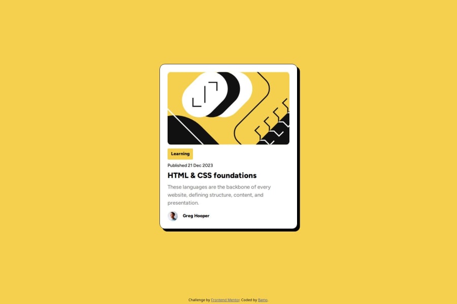
Design comparison
Solution retrospective
Not much
What challenges did you encounter, and how did you overcome them?The spacing between the elements in the card was a bit annoying to fix.
I used justify-content: space-between to fix it.
What specific areas of your project would you like help with?The challenge asks to make the font size decrease for mobile phones without using media queries, I think it is done using vw but then when the size of the viewport increases the font-size becomes too big.
Community feedback
- P@kodan96Posted 11 months ago
hi there! 🙌
For these situations, when you want your
font-sizeto dynamically change based on certain value you can use theclampfunction.the syntax is:
font-size: clamp(min-size, preffered-size, max-size);replace the variables in the parentheses with actual values.
this will keep your
font-sizebetween min-size and max-sizeHope this helps 🙏
Good luck and happy coding! 💪
Marked as helpful2
Please log in to post a comment
Log in with GitHubJoin our Discord community
Join thousands of Frontend Mentor community members taking the challenges, sharing resources, helping each other, and chatting about all things front-end!
Join our Discord
