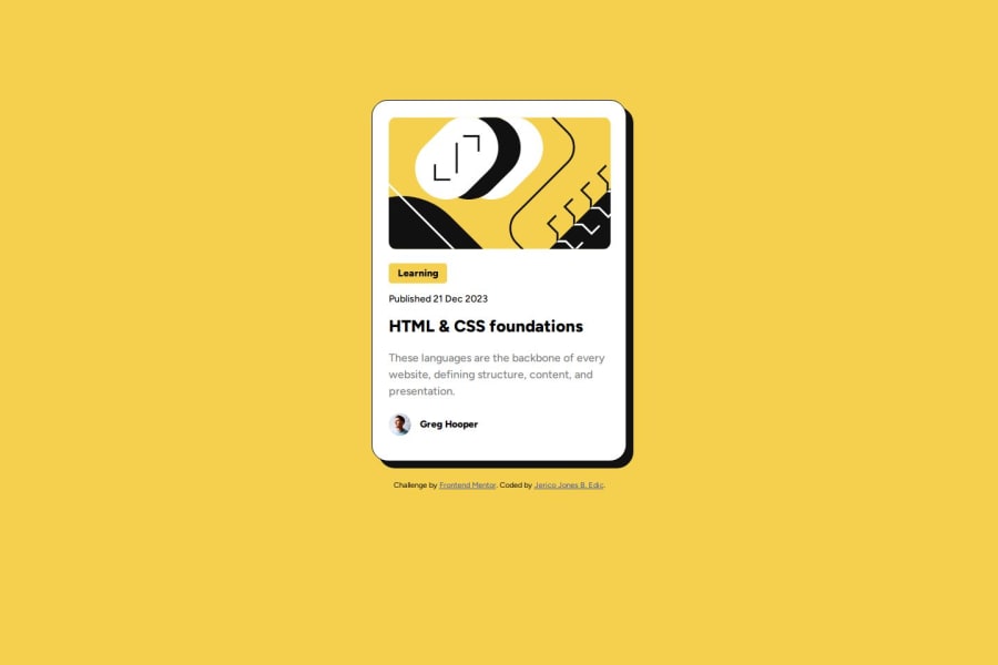
Design comparison
Solution retrospective
I am most proud that I was able to complete the challenge much faster and I had lesser time searching for solutions when I encountered problems. I would continue to learn more and more to achieve my dreams.
What challenges did you encounter, and how did you overcome them?I had problem positioning the author avatar and author name on the last part but I was able to solve it after searching for which property best suites the design.
What specific areas of your project would you like help with?I would like help with other selectors that is lesser and easier to understand than what I have used in my code. I would also like if there are suggestions on how I would improve my CSS codes.
Community feedback
- P@danielmrz-devPosted 9 months ago
Hey there! 🙋🏽♂️
Congrats on completing the challenge! ✅
Your project looks fantastic!
Here's a tip to make it even better:
Using
marginand/orpaddingisn't always the best way to center an element. Try this super efficient method to center an element vertically and horizontally:📌 Apply this CSS to the body (skip position or margins to make it work correctly):
body {
    min-height: 100vh;
    display: flex;
    justify-content: center;
    align-items: center;
}
Hope this helps!
Keep up the great work!
Marked as helpful0@0653JericoPosted 9 months ago@danielmrz-dev Thank you so much sir, will surely read about that, understand it and apply it.
1 - @DylandeBruijnPosted 9 months ago
@0653Jerico
Hiya! 👋
Congratulations on your solution, it looks very close to the design! I can tell you put a lot of effort into it. You can achieve your dreams!
Things I like about your solution 🎉
- Good start with responsiveness
- Use of some semantic HTML elements
- Clear descriptive CSS classes
Things you could improve ✍️
- Add a bit of padding to your body element so the card has room to breath on smaller viewports. You could also add
min-height: 100vhso thebodytakes up100vhwhile still being able to grow.
body { background: hsl(47, 88%, 63%); padding-inline: 2rem; min-height: 100vh; }-
Try using CSS variables they make your values more reusable.
-
I see you use
padding: nonehere:
* {
    margin: 0;
    padding: none;
    box-sizing: border-box;
    font-family: "Figtree";
}
This is not a valid value for
padding. Try usingpadding: 0.-
You could experiment with Flexbox and center your card.
-
You have a fixed
widthandheighton your container, this will cause overflow issues when the content in your container gets too big.
I hope you find my feedback valuable, and I would appreciate it greatly if you could mark my comment as helpful if it was! 🌟
Let me know if you have more questions and I'll do my best to answer them. 🙋♂️
Happy coding! 😎
Marked as helpful0@0653JericoPosted 9 months ago@DylandeBruijn Thanks for the notice sir, and will surely apply these. Also, I don't quiet get the fixed width and height. How should I fix that sir?
0@DylandeBruijnPosted 9 months ago@0653Jerico
See the updated code:
.container {
    max-width: 300px;
    background-color: hsl(0, 0%, 100%);
    margin: 10% auto 2%;
    padding: 1.5em;
    border: 1px solid;
    border-radius: 1.5em;
    box-shadow: 10px 10px hsl(0, 0%, 7%);
}
This will make your card a bit responsive by default as well.
You can update the image too:
img {
    border-radius: 0.7em;
    max-width: 100%;
    margin-bottom: 1em;
}
0
Please log in to post a comment
Log in with GitHubJoin our Discord community
Join thousands of Frontend Mentor community members taking the challenges, sharing resources, helping each other, and chatting about all things front-end!
Join our Discord
