Design comparison
Solution retrospective
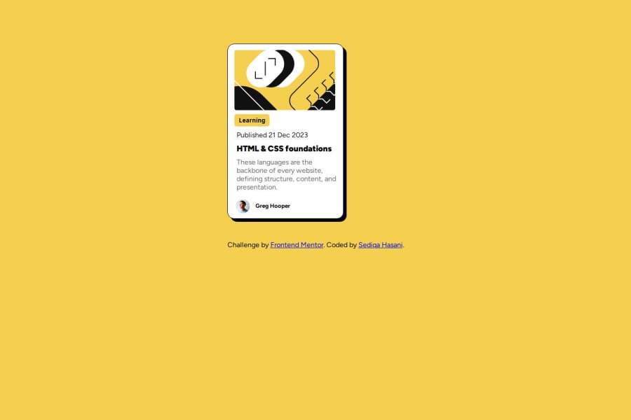
I want to know what height and width I should use for the solution to make it similar to the challenge's design. The projects i work on are either smaller or larger than the original design.
Community feedback
- @masalatimothyPosted 6 months ago
Next time try to put the blog card in the center of the web page, using CSS flexbox{display:flex; justify-content:center; align-items:center; and setting the height : 100vh;} , and make sure that the look as close to the design as possible copying the font-family, size and so on
Marked as helpful0 - @ArshiyaASMPosted 6 months ago
salame sedige , az in code braye body khodet estefade kon be jay grid : body { height: 100vh; display: flex; flex-direction: column; justify-content: center; align-items: center; }
0
Please log in to post a comment
Log in with GitHubJoin our Discord community
Join thousands of Frontend Mentor community members taking the challenges, sharing resources, helping each other, and chatting about all things front-end!
Join our Discord
