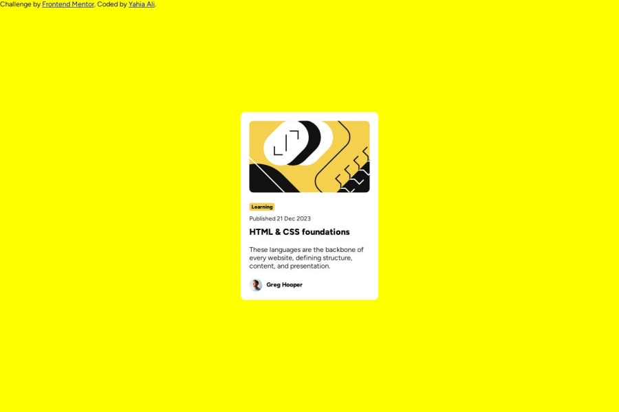
Design comparison
SolutionDesign
Solution retrospective
Why do I feel like font is smaller in the design than in style sheet?
Community feedback
- @danielmrz-devPosted 9 months ago
Hello @YahiaG!
Your solution looks excelent!
I have just one suggestion:
📌 To improve semantic clarity, opt for
<h1>over<h2>for your main title.It's more than just text size — it's about structuring your content effectively:
<h1>to<h6>are used to define HTML headings, with<h1>being the most significant.- Stick to one
<h1>per page for the main title, and maintain the titles hierarchy with<h1>,<h2><h3>, and so on.
While these adjustments might not alter the visual appearance much, they significantly enhance semantic clarity, SEO optimization, and accessibility.
Hope this suggestion proves helpful! Keep up the great work!
Marked as helpful1
Please log in to post a comment
Log in with GitHubJoin our Discord community
Join thousands of Frontend Mentor community members taking the challenges, sharing resources, helping each other, and chatting about all things front-end!
Join our Discord
