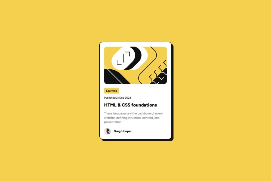
Design comparison
Solution retrospective
Was able make Mobile responsive easily this time unlike the confusion with qr-code project. Next time I would like to practice grid because I still went with flexbox.
What challenges did you encounter, and how did you overcome them?Getting the size correct was a problem. I constantly compared it to solution to get it as close as possible but this doesn't seem efficient.
What specific areas of your project would you like help with?The best approach to get size if you don't have figma design files?
Community feedback
- Account deleted
Based on the project you've undertaken, when it comes to coding a design image, there are a couple of methods(feel free to watch Cavin Powel and CoderCoder how they approach the project) you can use:
-
Create the Design in Figma from Scratch: If you have the design image but not the Figma file, consider creating the design from scratch in Figma. This approach offers several advantages:
- Understanding the Design: By designing in Figma, you'll grasp the layout, typography, colors, and other elements more deeply, aiding in coding.
- Responsive Design: Figma supports responsive designs, crucial in modern web development. Experiment with various breakpoints to see how the design adapts.
-
Code the Design by Judgment: If time or resources don't permit using Figma, you can attempt coding based on the image:
- Analyze the Design: Study the image closely to comprehend its layout, typography, and colors.
- Translate to HTML/CSS: Code HTML and CSS to replicate the layout and styles.
- Iterative Improvement: Refine your code iteratively to match the design accurately.
Considering your current web development experience, I suggest starting with the first approach: creating the design in Figma from scratch. This method will enhance your understanding of the design process and its translation into code.
As you advance, you might explore the second approach.This method can improve efficiency and confidence as your skills grow.
Marked as helpful1 -
- @GoddaybcPosted 9 months ago
I love the hover on the "Learning" and also the box shadow nice job
1
Please log in to post a comment
Log in with GitHubJoin our Discord community
Join thousands of Frontend Mentor community members taking the challenges, sharing resources, helping each other, and chatting about all things front-end!
Join our Discord
