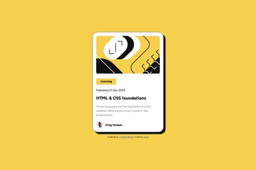
Submitted over 1 year agoA solution to the Blog preview card challenge
Blog preview card solution
accessibility, bem
@Bamo-D-Abdallah

Solution retrospective
What are you most proud of, and what would you do differently next time?
I redid it to use clamp() and also use mobile-approach first.
None
What specific areas of your project would you like help with?Any general code feedback would be appreciate it especially with the way I handled responsive design using width, max-width and medai queries.
Code
Loading...
Please log in to post a comment
Log in with GitHubCommunity feedback
No feedback yet. Be the first to give feedback on Bamo-D-Abdallah's solution.
Join our Discord community
Join thousands of Frontend Mentor community members taking the challenges, sharing resources, helping each other, and chatting about all things front-end!
Join our Discord