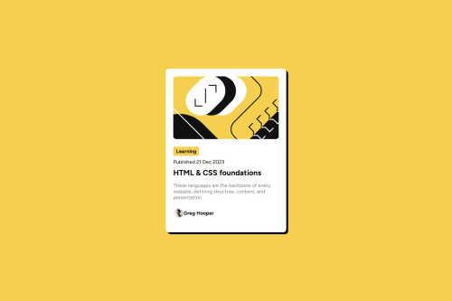
Submitted over 1 year agoA solution to the Blog preview card challenge
blog preview card solution
@joaomorita

Solution retrospective
What are you most proud of, and what would you do differently next time?
I really liked this one, with the figma I could see much better the sizes.
What specific areas of your project would you like help with?If anyone can look at my solution and give me some feedbacks about how I can improve, I appreciate. Thank you!
Code
Loading...
Please log in to post a comment
Log in with GitHubCommunity feedback
No feedback yet. Be the first to give feedback on João Vitor Morita's solution.
Join our Discord community
Join thousands of Frontend Mentor community members taking the challenges, sharing resources, helping each other, and chatting about all things front-end!
Join our Discord