

Design comparison
SolutionDesign

Solution retrospective
What are you most proud of, and what would you do differently next time?
Use of web components and media queries
What challenges did you encounter, and how did you overcome them?Positioning card for match with preview
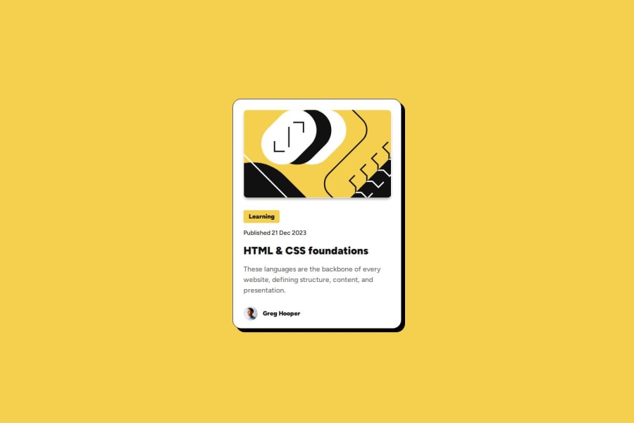
What specific areas of your project would you like help with?SVG stroke inside.
Community feedback
- P@marcel-schmidt-devPosted 7 months ago
Project Review: Frontend Mentor Blog Preview Card
Strengths
-
Semantic HTML:
- The project makes good use of semantic HTML5 tags like
<article>,<section>, and<footer>, which helps structure the content properly.
- The project makes good use of semantic HTML5 tags like
-
Responsive Design:
- The design is mobile-first, ensuring that the page looks good on smaller devices and scales up for larger screens using media queries.
-
CSS Flexbox:
- Flexbox is used to create a flexible layout that adjusts nicely to different screen sizes and keeps content centered and aligned.
-
Web Components:
- The use of Web Components (
HTMLElementand shadow DOM) is modern, modular, and keeps the styling and functionality encapsulated. This is a great practice for reusable and maintainable components.
- The use of Web Components (
Areas for Improvement
-
Accessibility:
- Consider improving accessibility by adding ARIA attributes where necessary. For example, ensure that icons and interactive elements have descriptive labels for screen readers.
- Alt text for images is crucial for users with visual impairments. Ensure that all images have appropriate alt descriptions.
-
Performance Optimization:
- Consider inlining critical CSS for faster initial rendering. This can help reduce render-blocking resources, improving performance, especially on mobile networks.
-
Error Handling:
- In case of using external assets (e.g., fonts, images, or CSS), implement fallback mechanisms for loading failures.
-
Browser Compatibility:
- While using Web Components is a great practice, ensure that appropriate polyfills are included for older browsers that may not support shadow DOM or custom elements.
General Suggestions
- Code Structure: The project code is clean and well-structured, but consider adding comments in critical sections, especially for future collaborators.
- Documentation: Ensure that the README provides instructions for installing dependencies (if any) and running the project locally, even if it’s a simple static site.
- Cross-browser Testing: Verify that the component behaves consistently across different browsers and devices, especially given the use of newer technologies like shadow DOM.
Conclusion
This project is a well-executed solution with modern front-end practices like Web Components and Flexbox. With minor improvements in accessibility and performance, it can be a top-notch implementation.
0 -

Please log in to post a comment
Log in with GitHub
Join our Discord community
Join thousands of Frontend Mentor community members taking the challenges, sharing resources, helping each other, and chatting about all things front-end!
Join our Discord